
The goal of this project was to design an innovative educational app for primary school students that not only aid in their education, but also stimulate and cultivate their creativity. The app was designed specifically to work on digital whiteboards.
Project Info
Duration: 3 months
Skills: UI Design – UX Design – User Research
Category: Education
Skills: UI Design – UX Design – User Research
Category: Education
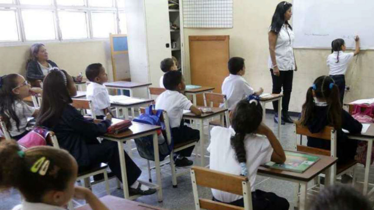
The Problem
In Ecuador, factors like a lack of creativity, limited knowledge about this subject, and the old-fashioned education system can lead to problems with focus and cognitive development in the classroom. This stifles creativity and doesn't give students the chance to grow.
Research
I conducted 5 in-depth interviews with teachers in the area as part of my field research. My goal was to understand the specific needs of both the teachers and students in order to design an application that would effectively meet those needs. To supplement my interviews, I also observed classes to gain a deeper understanding of the students' behavior.
Based on my research, I have identified the following key needs:
— Short exercise duration
The exercises in the application should be short and last no more than 15 minutes to accommodate the students who tend to become tired in the video room due to the darkness.
The exercises in the application should be short and last no more than 15 minutes to accommodate the students who tend to become tired in the video room due to the darkness.
— Skill-building activities
The activities should focus on developing skills and be visually appealing, with graphics that align with the themes and intuitive icons for ease of use.
The activities should focus on developing skills and be visually appealing, with graphics that align with the themes and intuitive icons for ease of use.
— Curriculum alignment
The app should contain at least one activity for each topic proposed in the Ministry of Education's curriculum and align with the objectives outlined in each unit.
The app should contain at least one activity for each topic proposed in the Ministry of Education's curriculum and align with the objectives outlined in each unit.
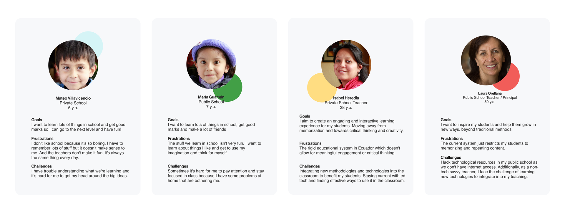
Personas
The research has led me to identify four distinct user personas. These personas represent the different user groups that the application will be serving:
— Private School Student
This persona represents a child who attends a private school and is likely to have access to more resources and a more structured educational environment.
This persona represents a child who attends a private school and is likely to have access to more resources and a more structured educational environment.
— Public School Student
This persona represents a child who attends a public school and may have limited resources and a less structured educational environment.
This persona represents a child who attends a public school and may have limited resources and a less structured educational environment.
— Young Teacher
This persona represents a teacher who is relatively new to the profession and may have less experience but be more tech-savvy.
This persona represents a teacher who is relatively new to the profession and may have less experience but be more tech-savvy.
— Middle-aged Teacher
This persona represents a more experienced teacher who may have been in the profession for several years and may be less familiar with new technology."
This persona represents a more experienced teacher who may have been in the profession for several years and may be less familiar with new technology."
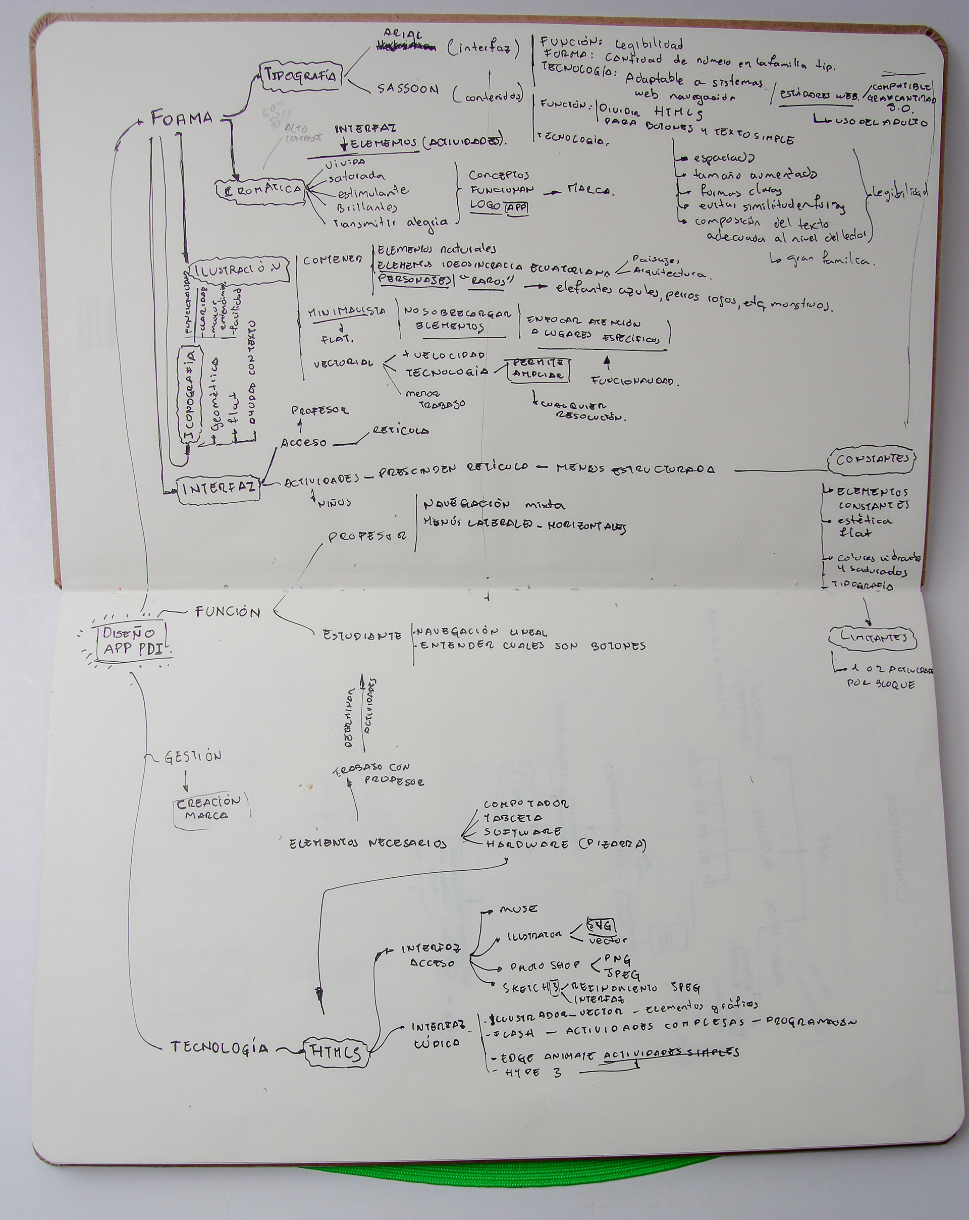
Ideation
This process starts with the generation of ideas and it is crucial to ensure that all design parameters and features are taken into consideration.
To ensure a comprehensive approach, a mind map was created to visually organize the information gathered during the research phase. The mind map separates the design parameters into distinct categories to make it easier to understand and refer back to later in the design process.
The main categories include:
— Form
This category encompasses the design elements such as typography, iconography, chromatics, and illustration that contribute to the visual appeal of the interface.
This category encompasses the design elements such as typography, iconography, chromatics, and illustration that contribute to the visual appeal of the interface.
— Function
This category focuses on the navigation structure of the interface, ensuring that the user can easily navigate through the application.
This category focuses on the navigation structure of the interface, ensuring that the user can easily navigate through the application.
— Technology
This category considers the underlying technology that powers the interface and its impact on the user experience.
This category considers the underlying technology that powers the interface and its impact on the user experience.
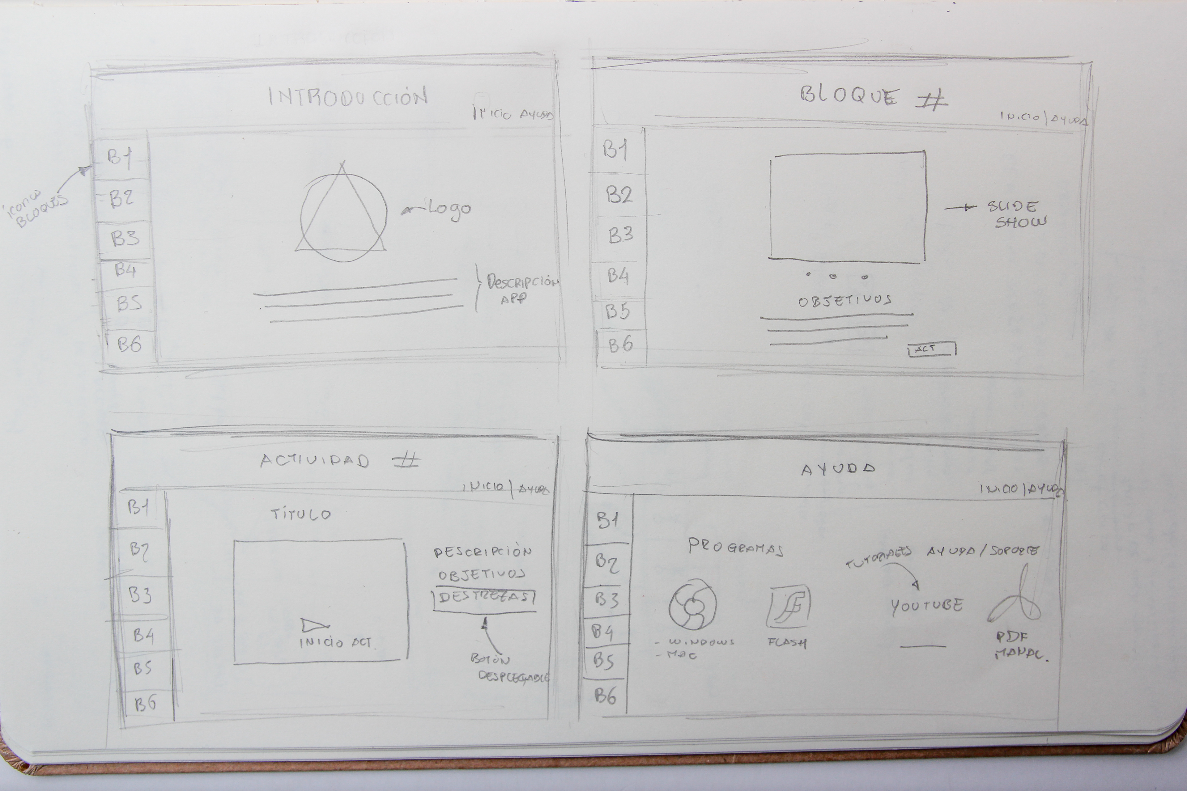
The next step is to design the interface, icons & illustrations. I started with pencil & paper, develop several paper prototypes before moving on to high fidelity wireframe.
Design System
The design system was developed with a user-centered approach to create a consistent, visually appealing, and functional user experience.
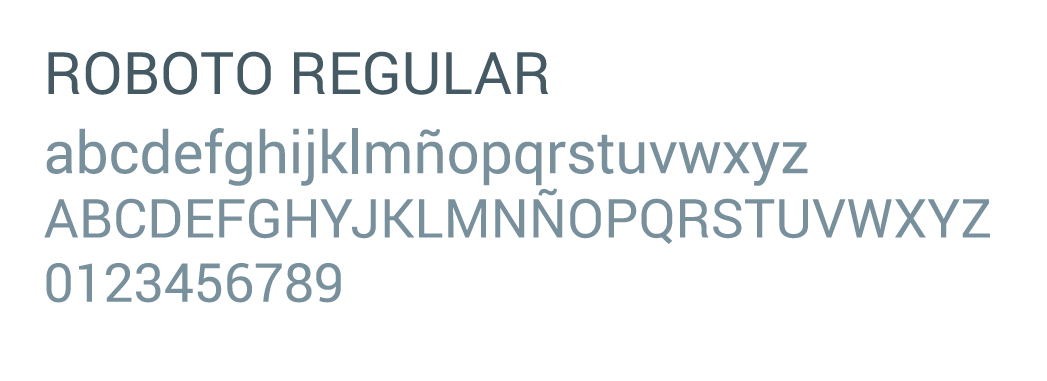
Typography
The primary goal was to ensure readability and accessibility for both the teachers operating the interface and the students participating in the activities. To achieve this, I selected two font families that offer variations and are adaptable to different screen systems and HTML technologies.
Roboto: This font family was chosen for the general interface that will be operated by the teachers. It is highly readable and technologically compatible with a wide range of devices, including cell phones and smart TVs.
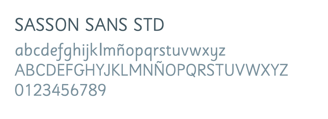
Sasson: This font family was chosen for the graphical interface of the activities for the students. It provides high legibility and intellegibility for all kinds of children, ensuring that all students can easily participate in the activities.
Color Palette
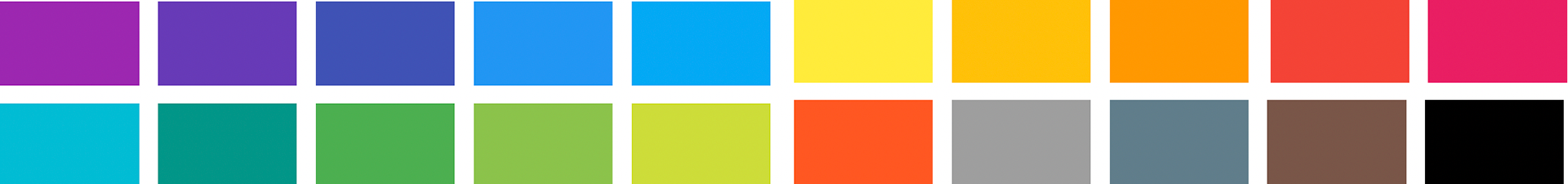
The goal was to create a stimulating, bright, vivid, and saturated palette that would be used throughout the different elements of the design, including the interface, activities, and illustrations.To achieve this, I worked by hand with watercolor, a pigment commonly used by children in their school tasks, on a chromatic circle. This circle included primary, secondary, and tertiary colors.
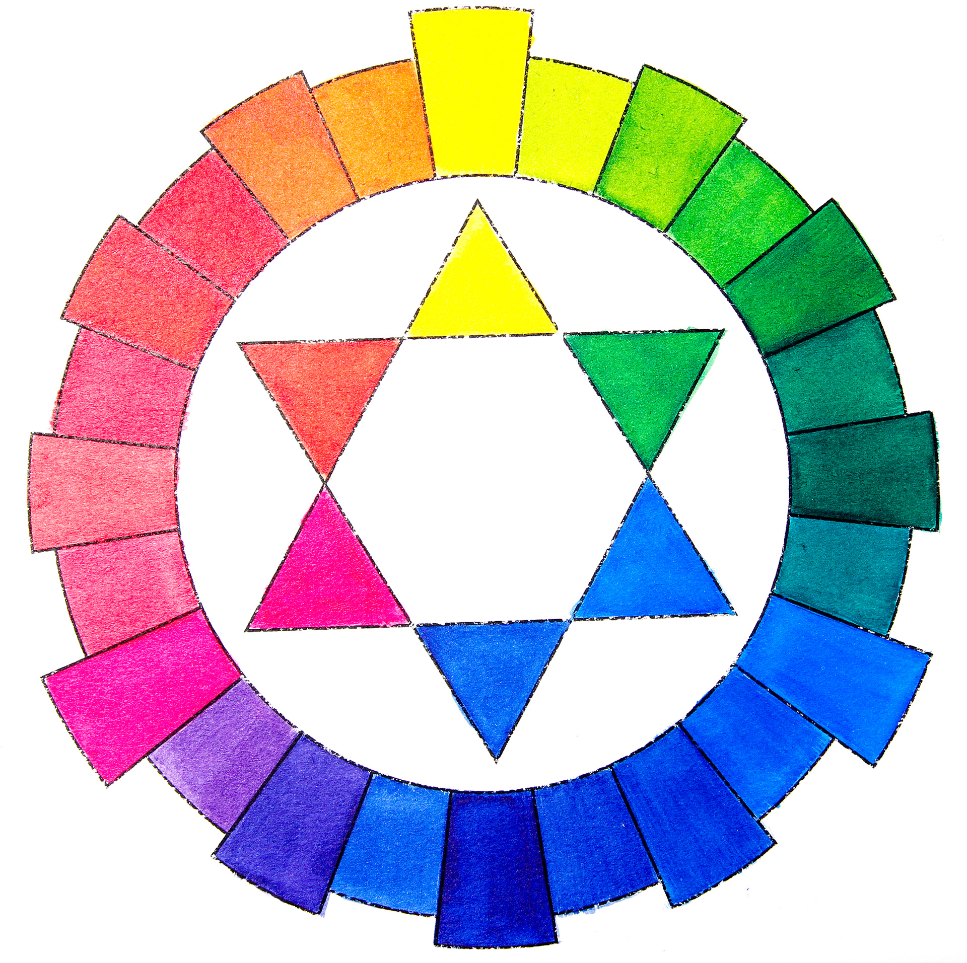
The chromatic wheel was then digitized and harmonic colors were extracted from each other, with neutral colors added to complete the palette.
The result was a wide color palette that, when combined with opacity variations and blending modes, allows for various applications in the interface, activities, and illustrations. The bright and vivid colors are sure to engage and inspire both teachers and students.
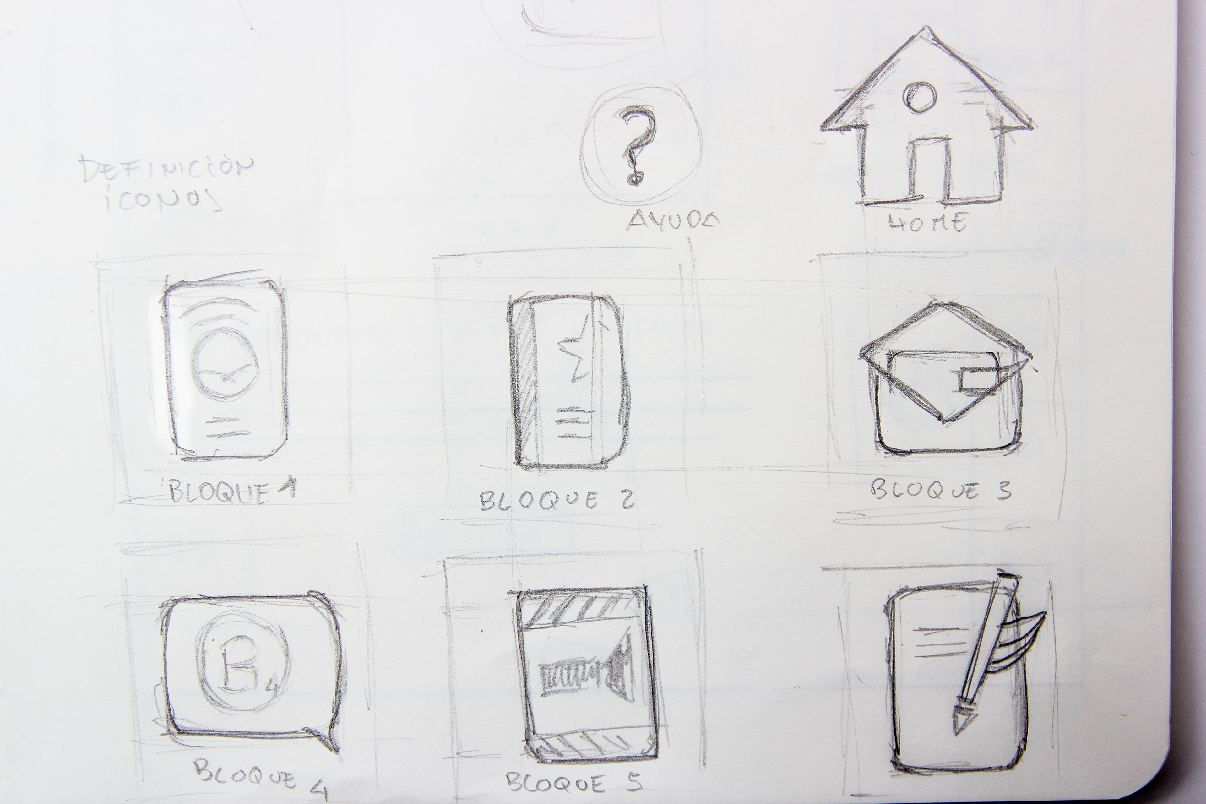
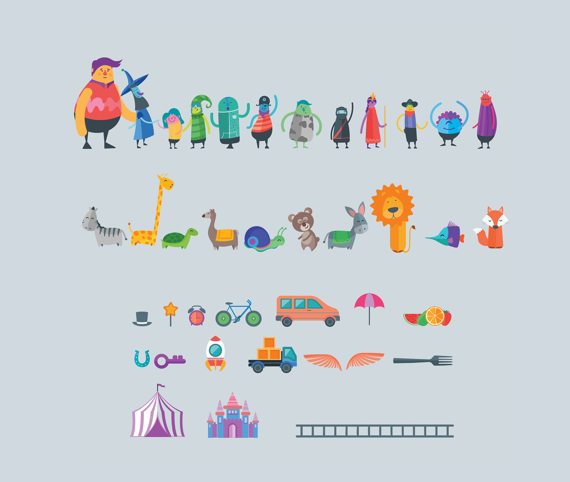
Icons
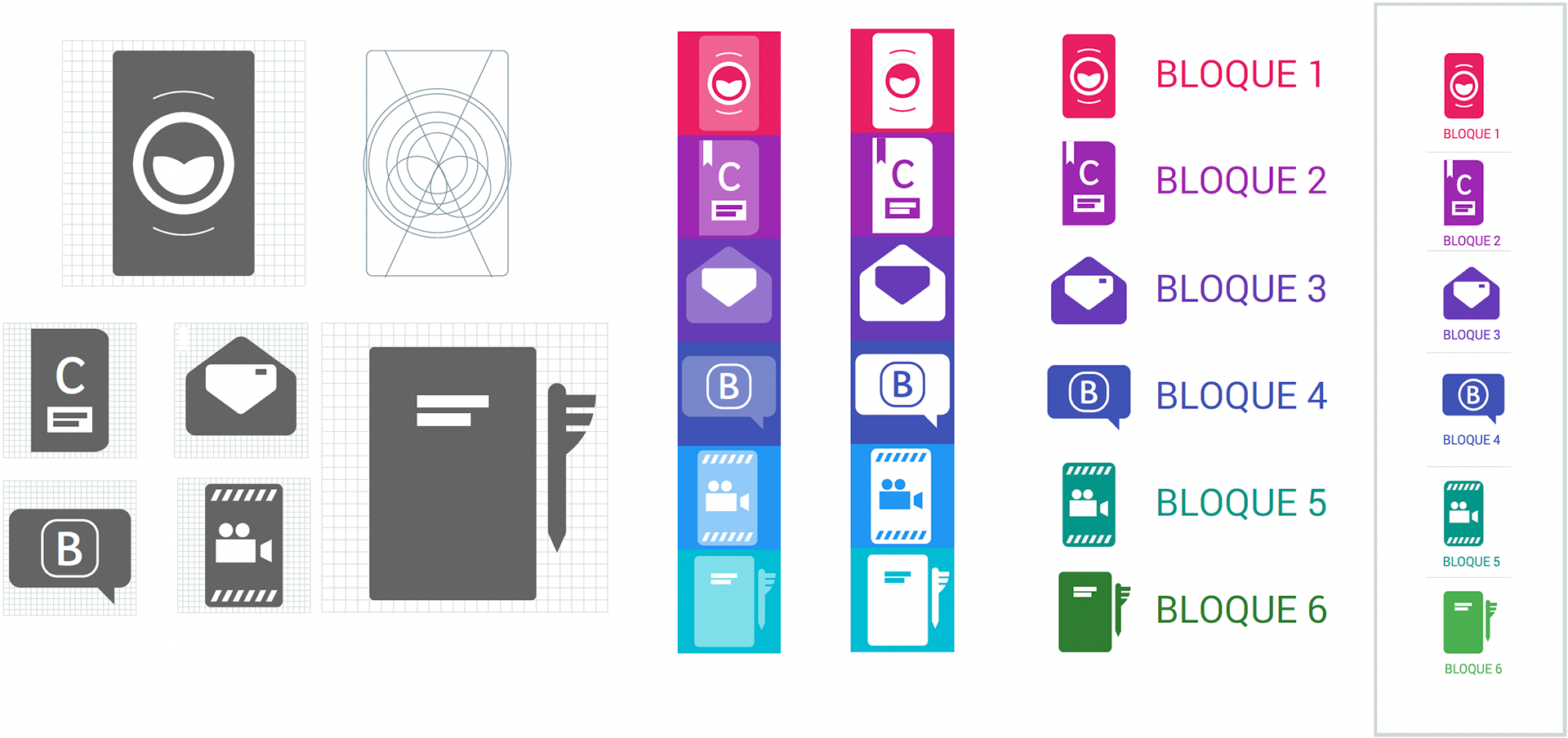
I started by reviewing the different blocks of the student book to identify key elements for each unit. I then chose two of these elements and combined them to create each icon, which serves as a simplified representation of each chapter or block.
To ensure consistency, I created a grid to geometrize the icons and verify their proportions. I then tested the icons in grayscale to check for proper contrast and experimented with different color applications until the most suitable one was found, which provides clear legibility on screens with a high degree of contrast.
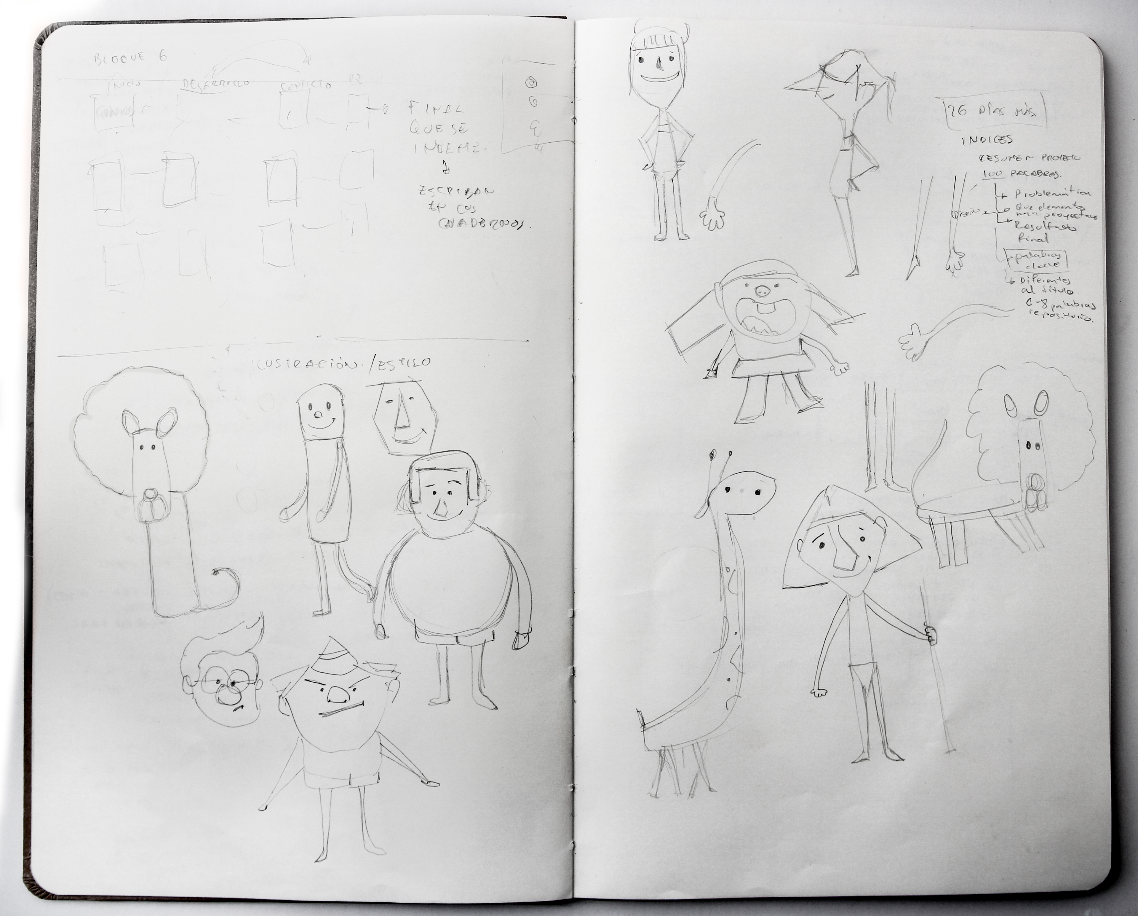
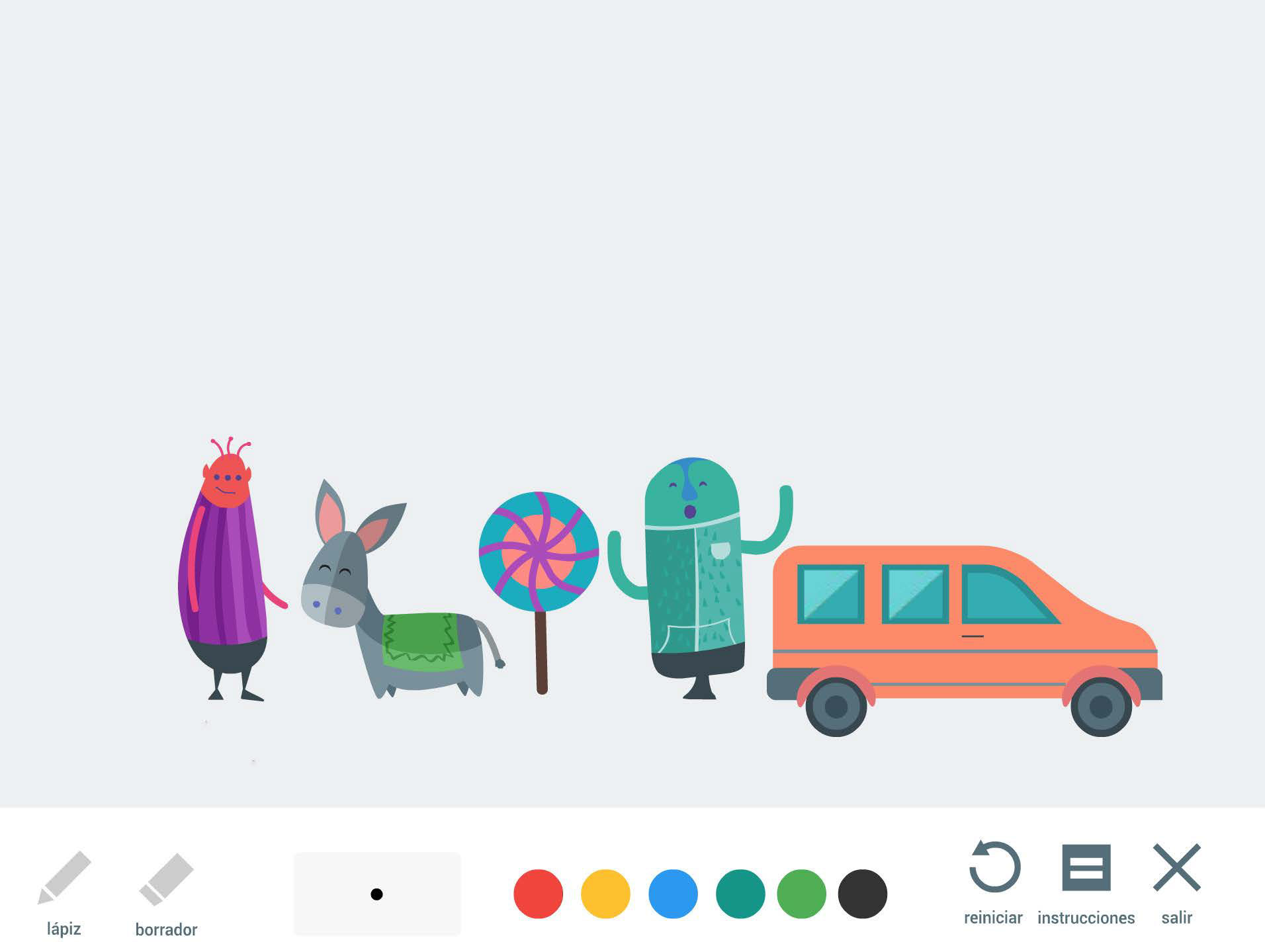
Illustration
I used "flat design" style of illustration. This style is characterized by starting with basic geometric shapes to create all elements. It was chosen for its modern and clean look, as well as its versatility and ease of use in a multimedia application. Flat design is mainly vector-based, allowing for greater versatility in different formats.
Architecture information
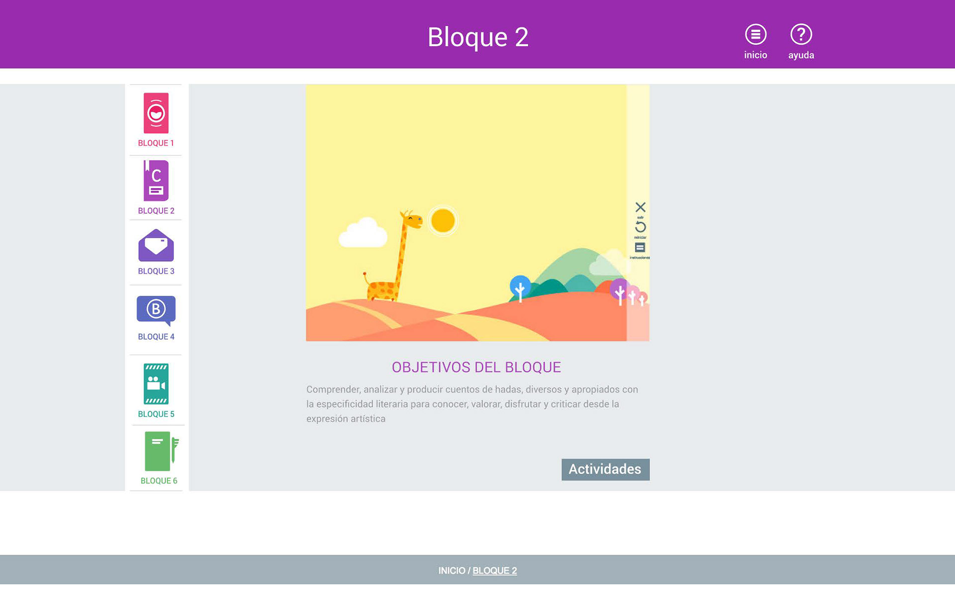
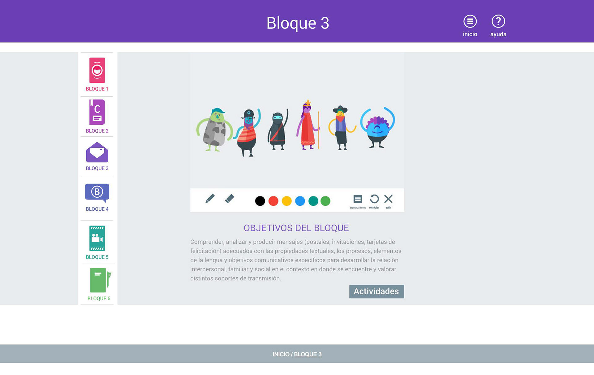
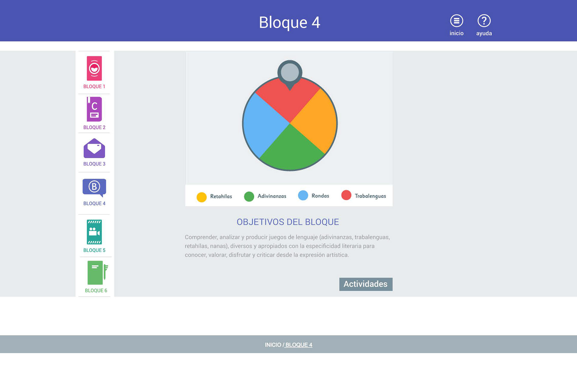
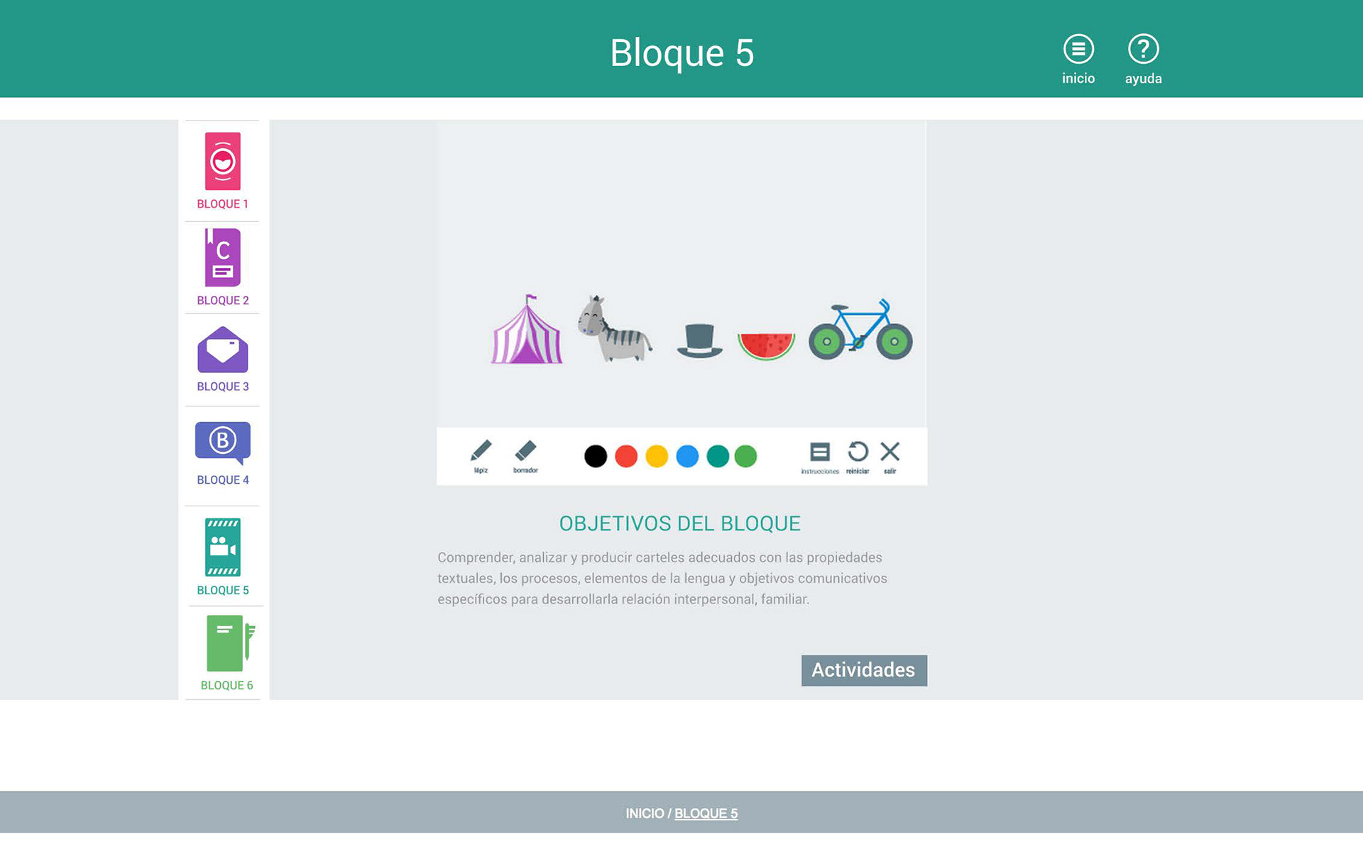
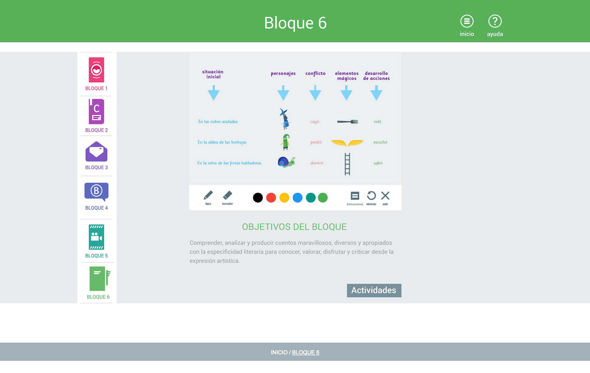
I've divided the app into 4 main sections:
Home, Blocks (1-6), Activities (1-6), and Help.
Home, Blocks (1-6), Activities (1-6), and Help.
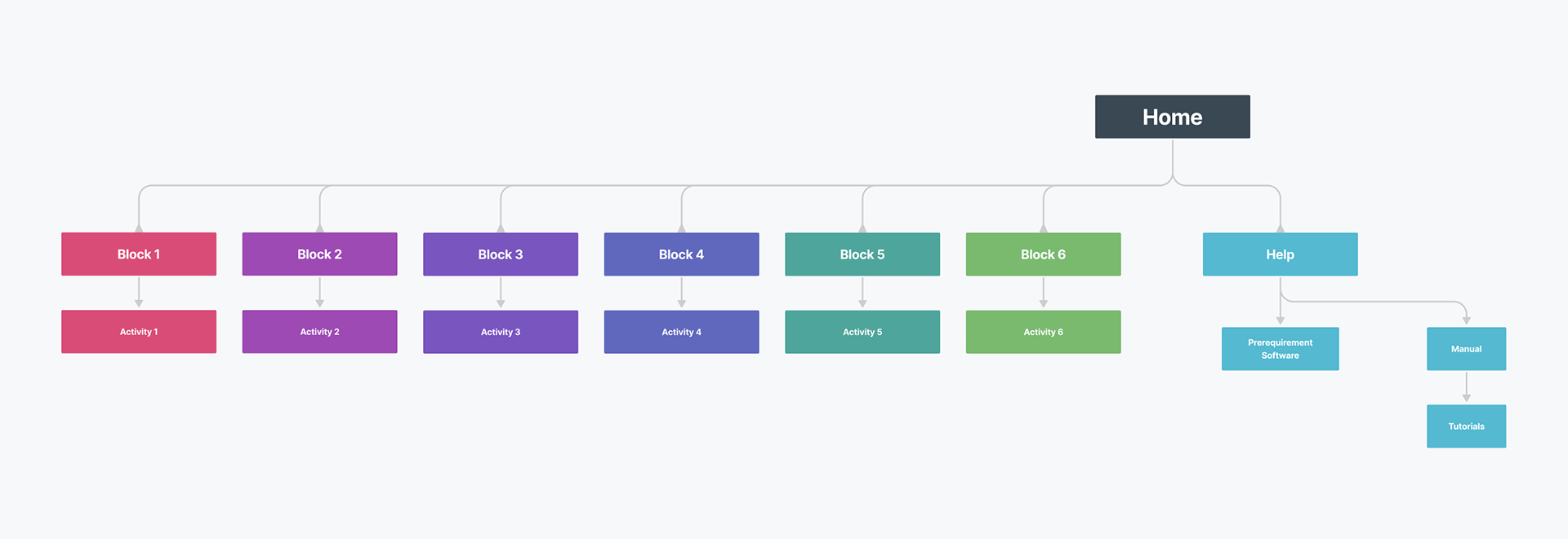
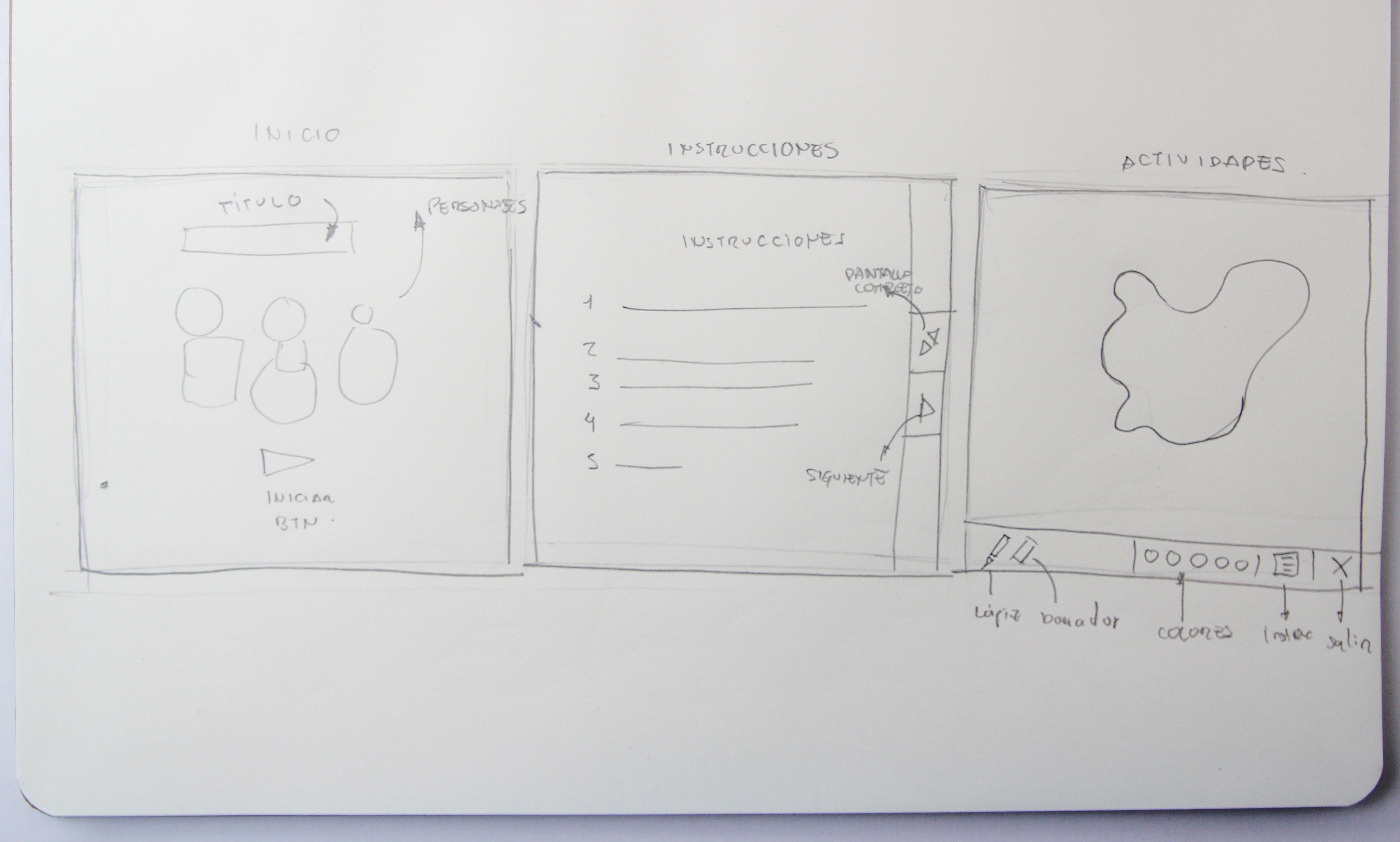
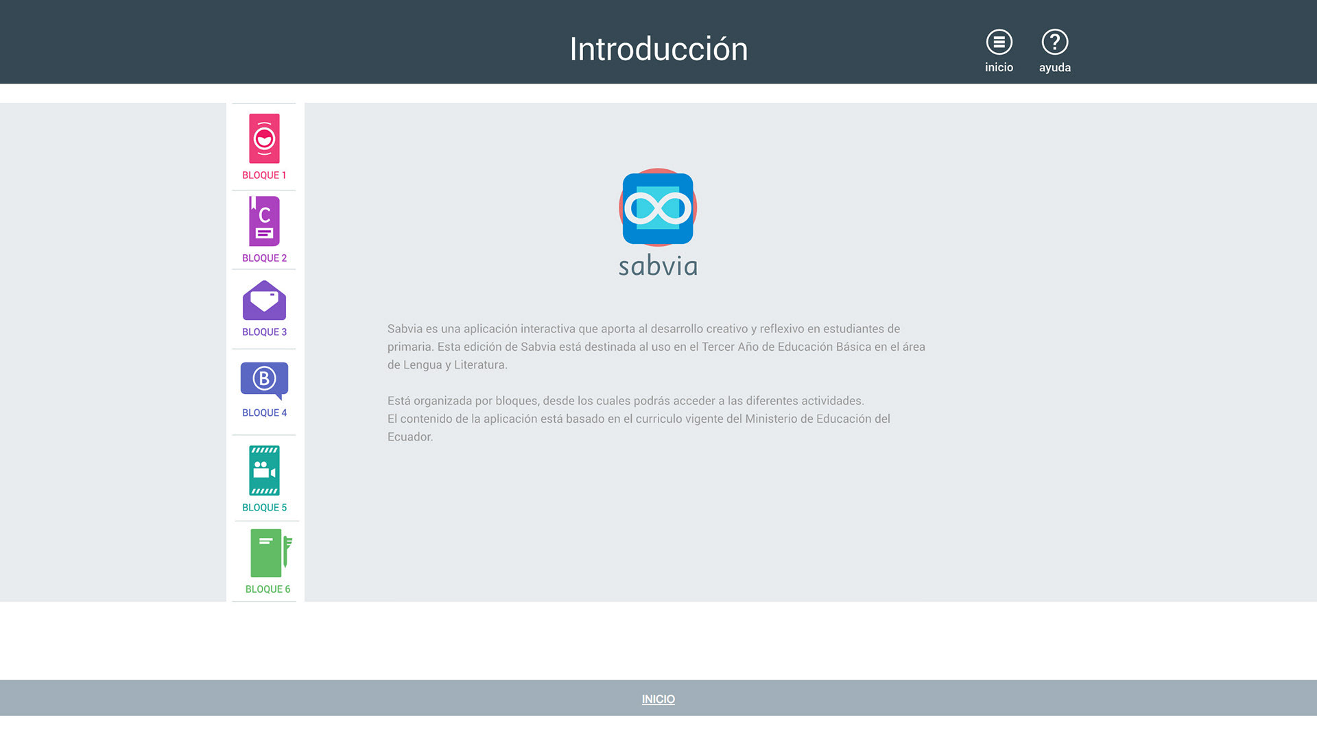
Prototype
The Home section is where you'll find a rundown of how the application works and what it has to offer for teachers and students.
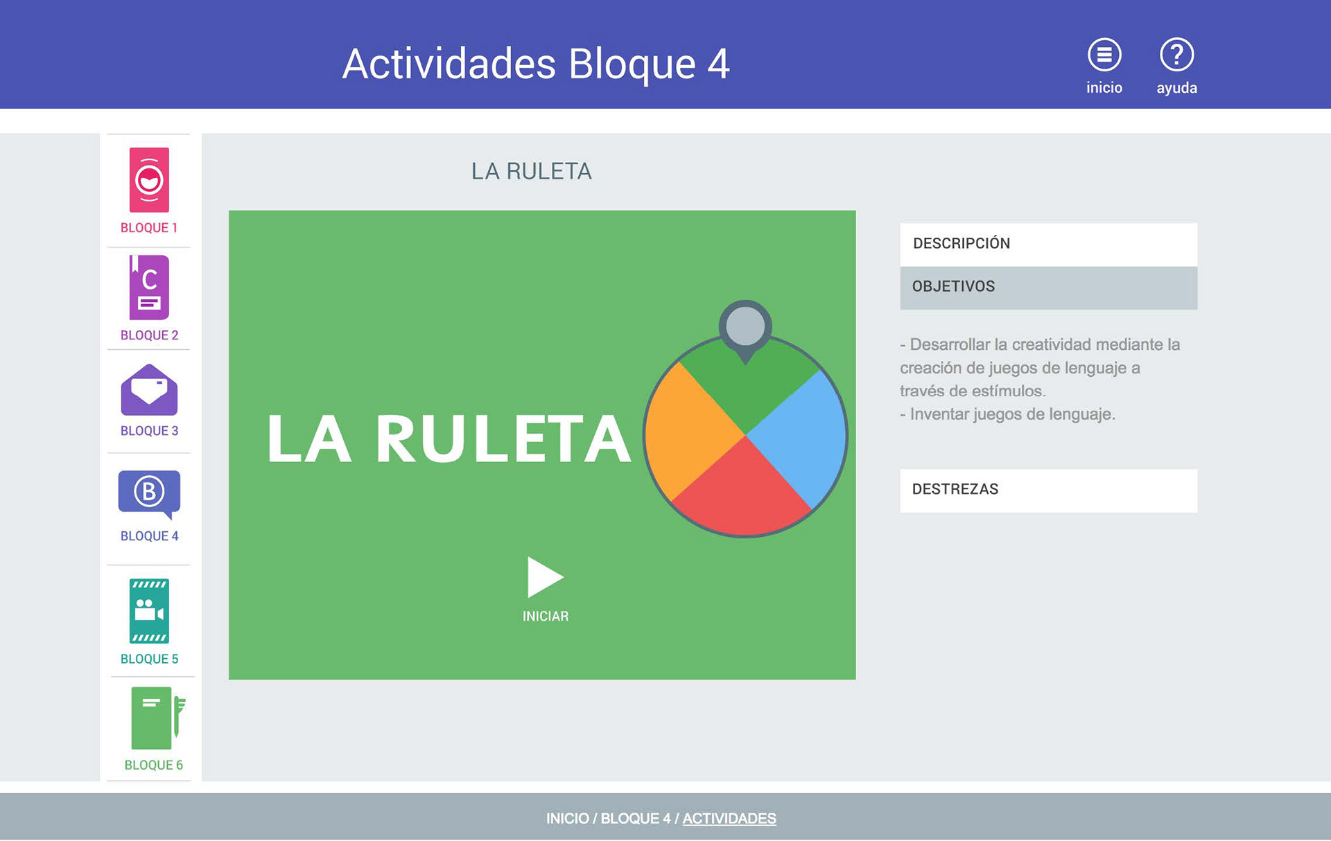
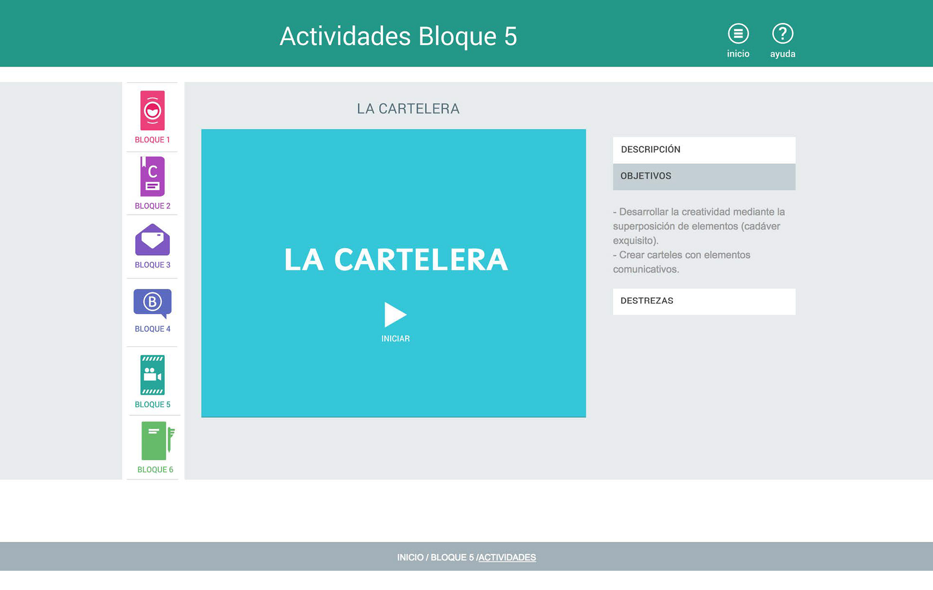
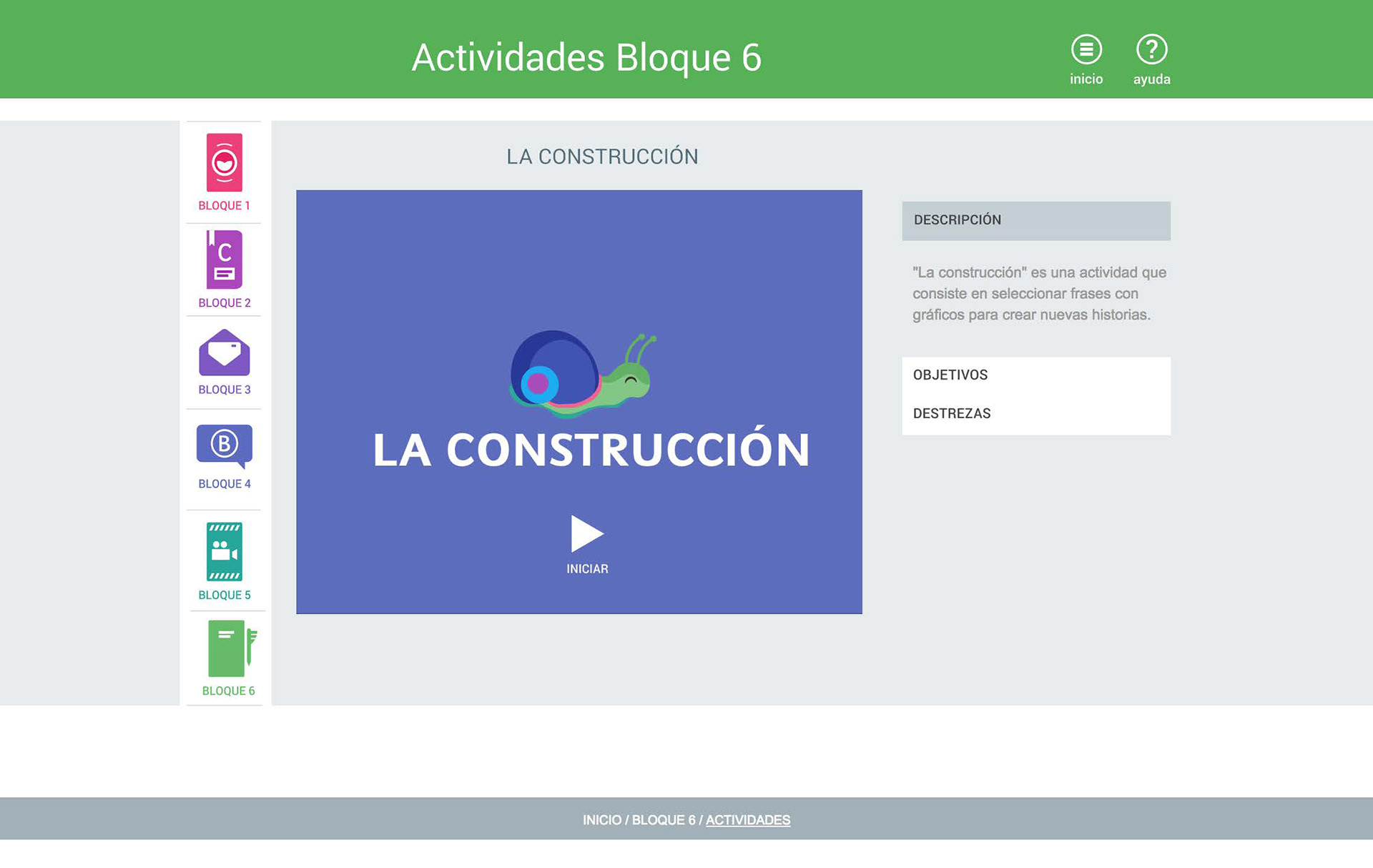
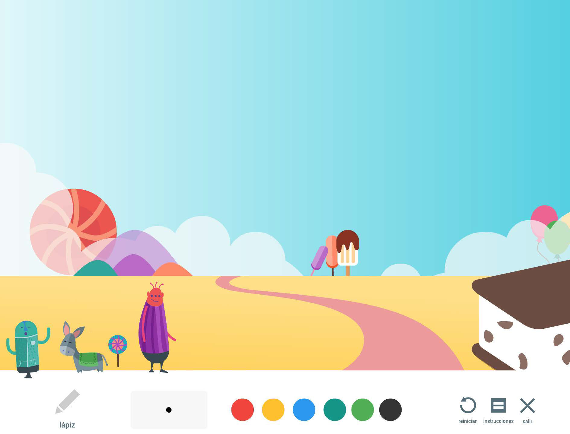
The Blocks screens showcases a gallery of preview images for each activity, along with a brief description of the objectives each block fulfills.
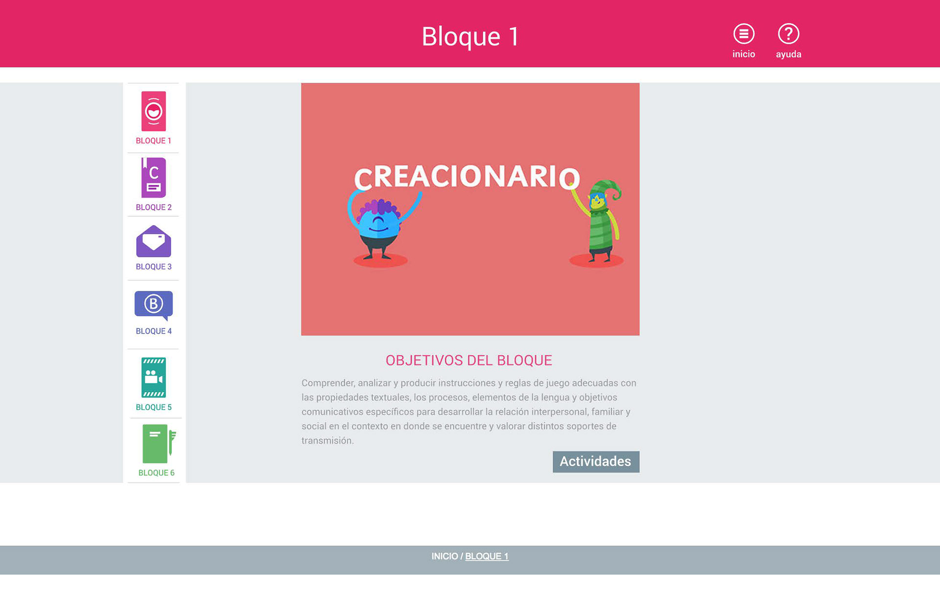
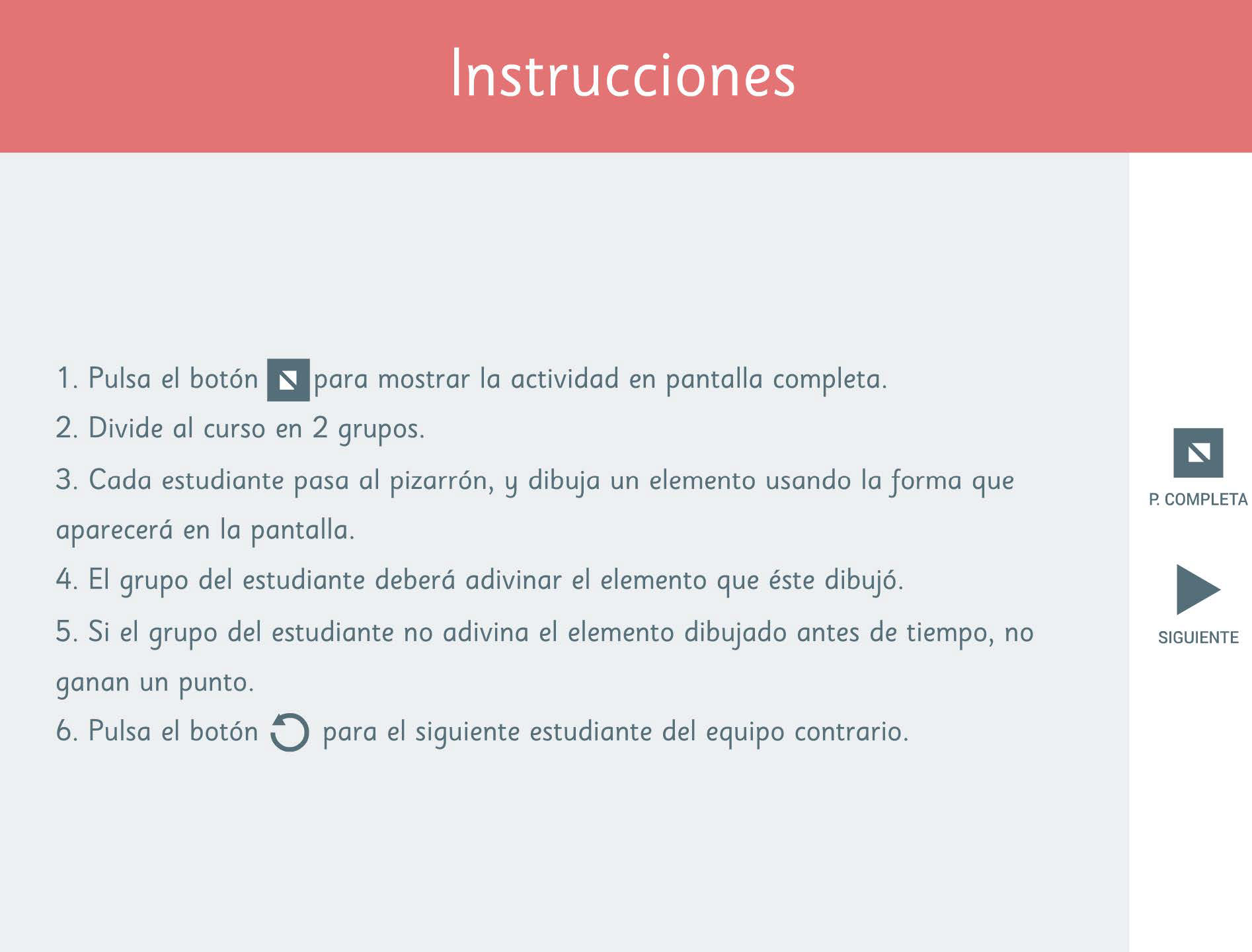
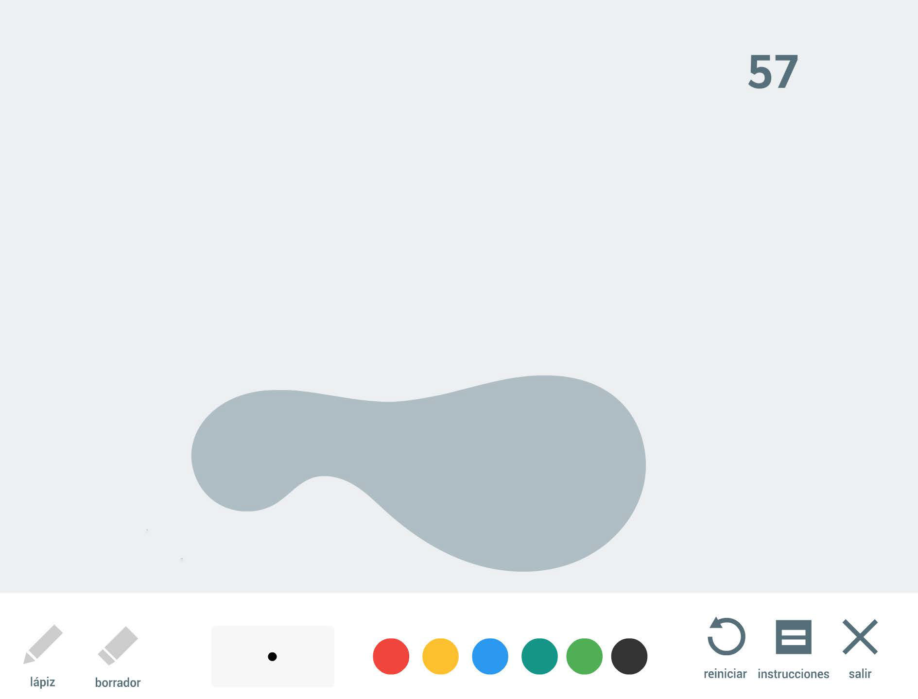
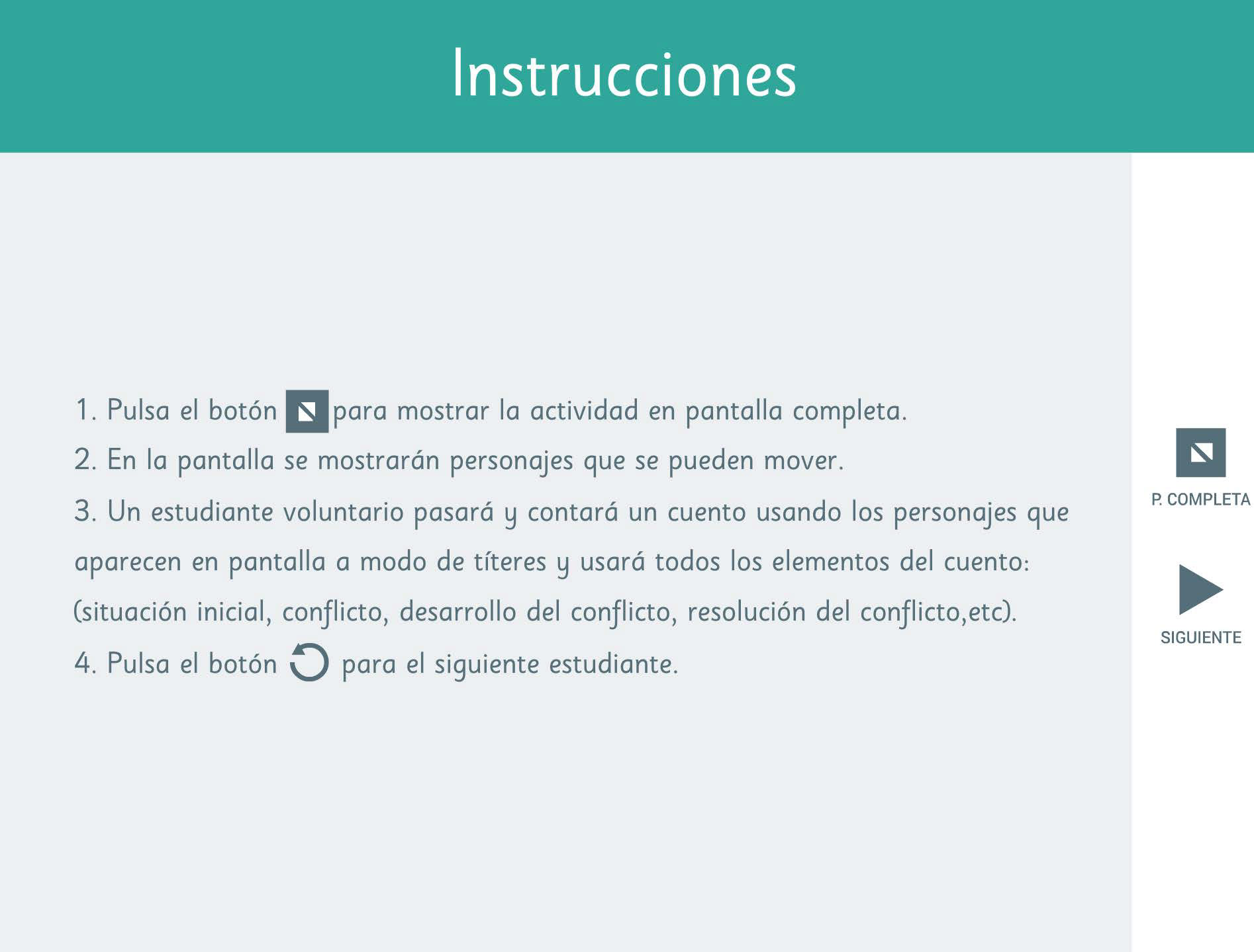
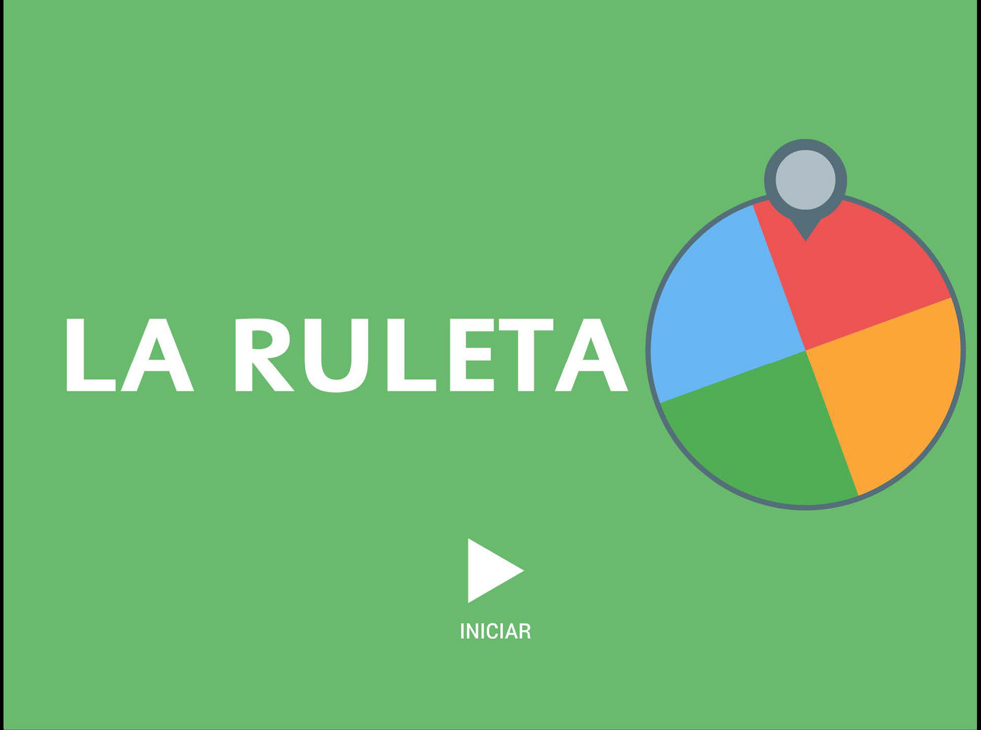
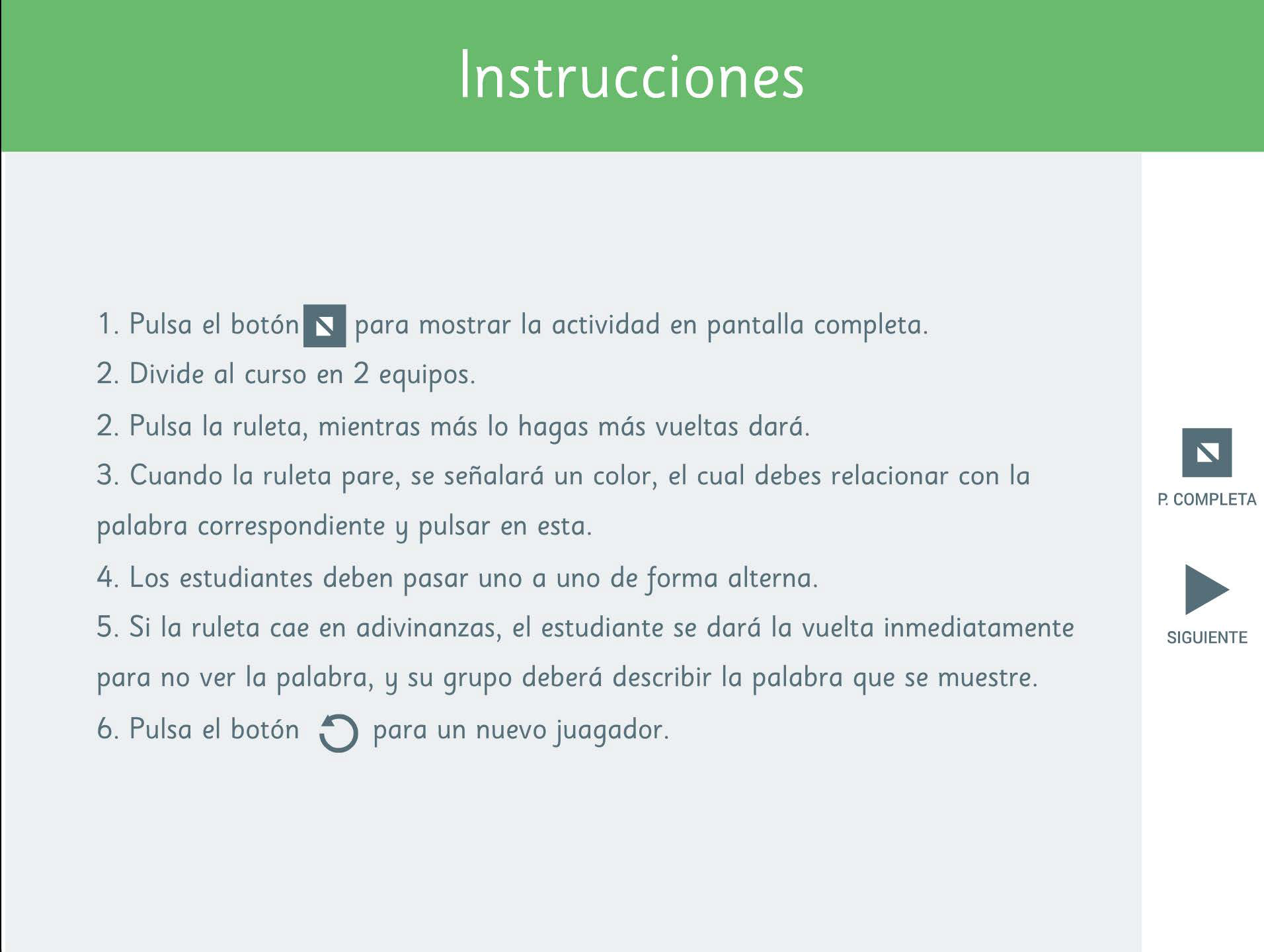
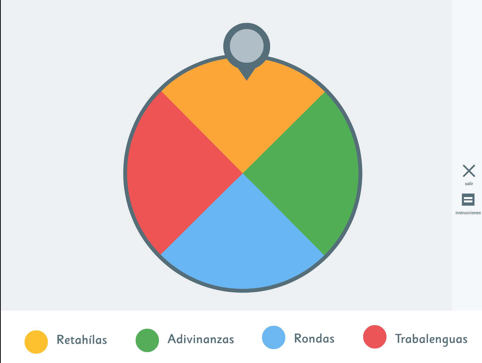
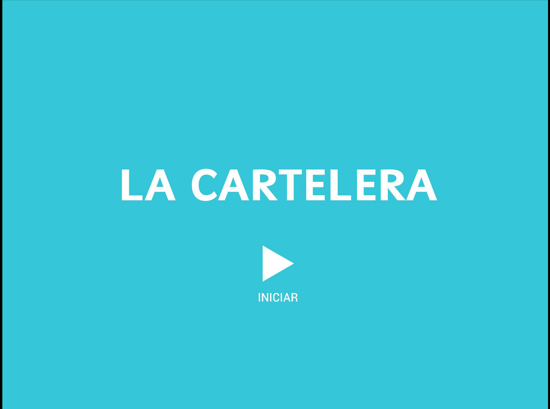
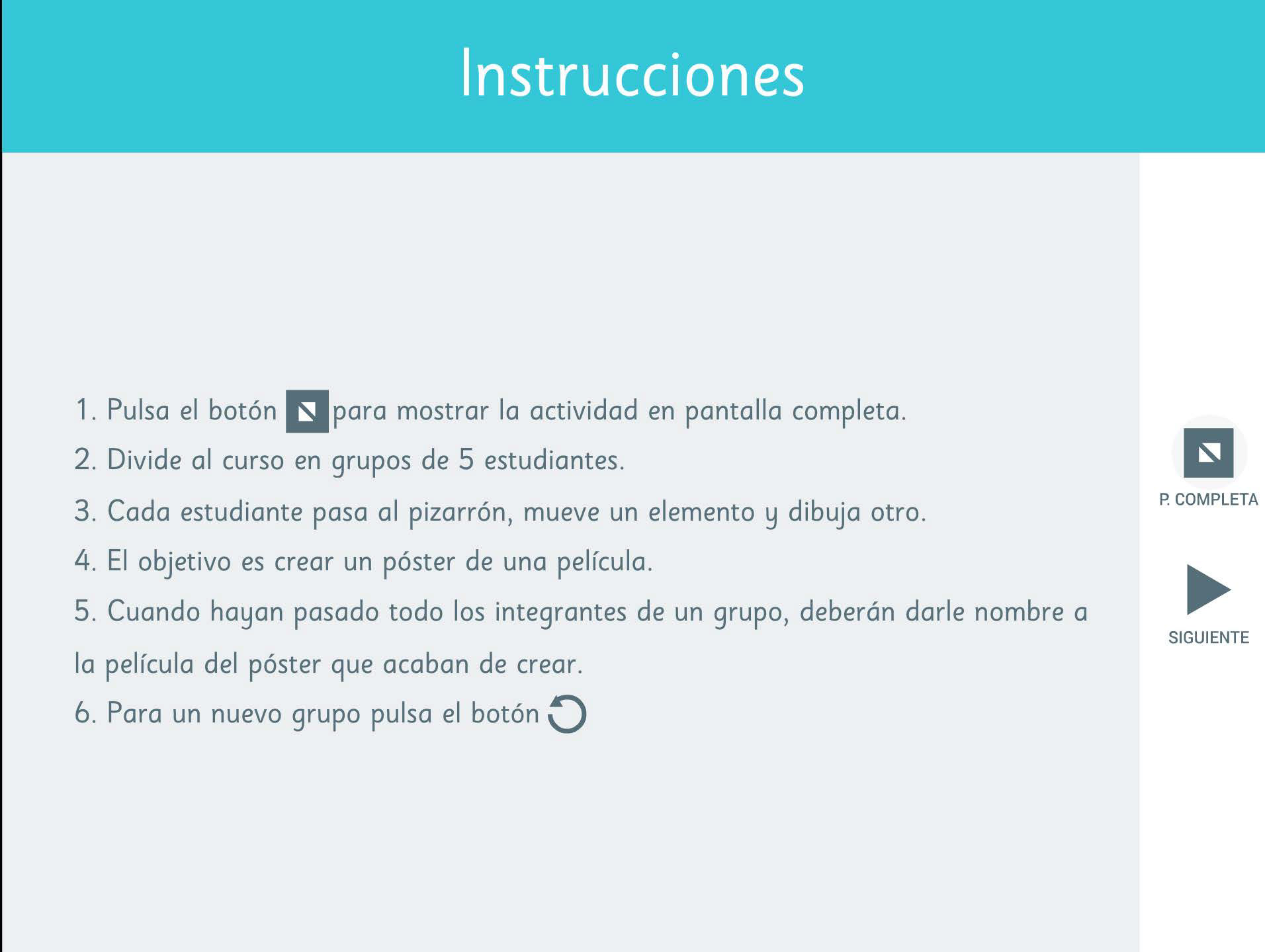
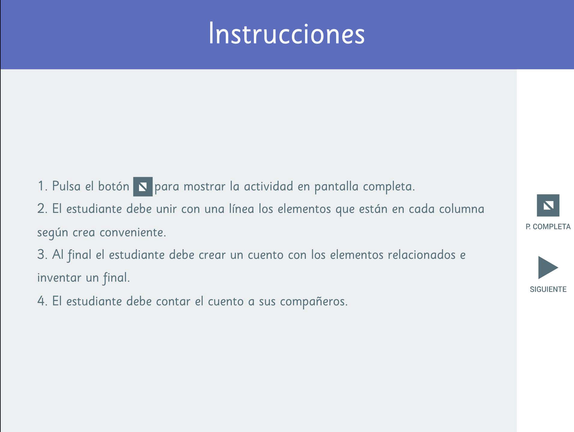
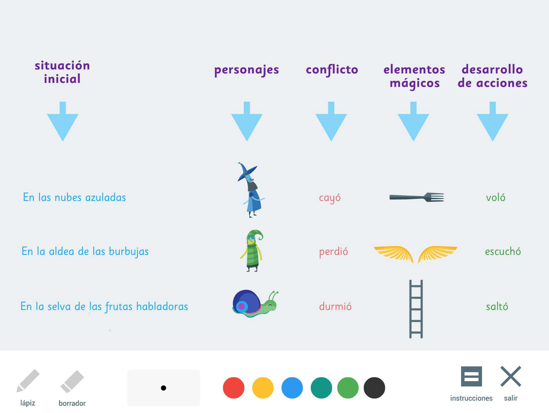
The Activities screen is where you'll experience the full range of what our application has to offer, with a full-screen mode available at the click of a button. You'll also find important information sections that describe the activity, its objectives, and the skills it helps develop.
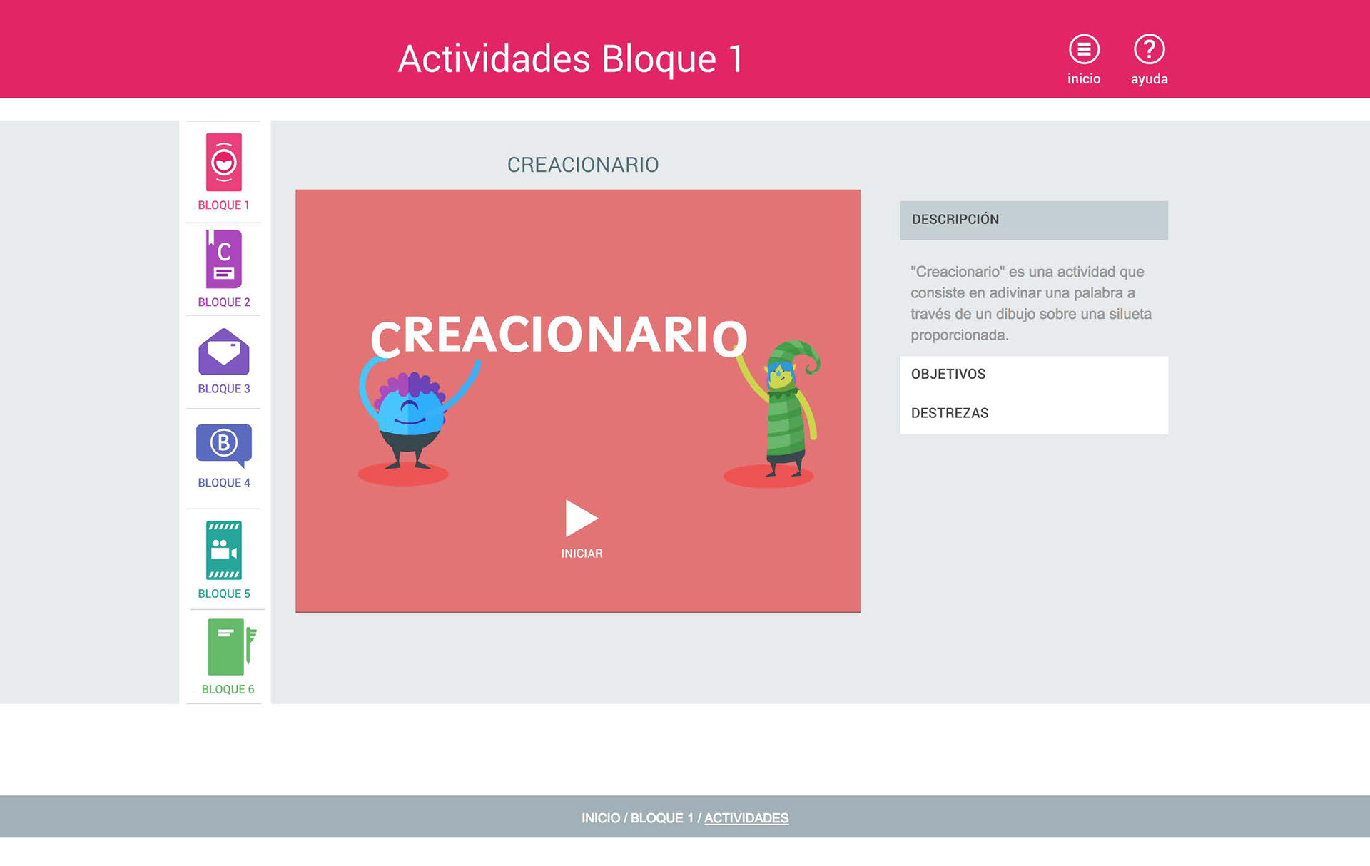
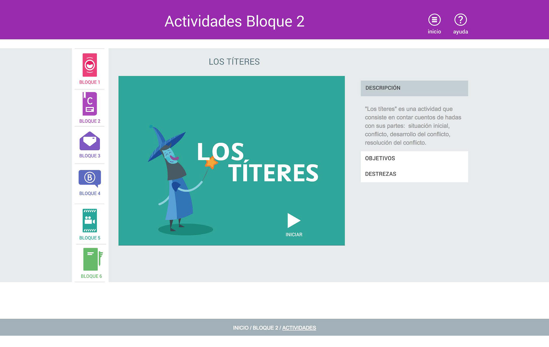
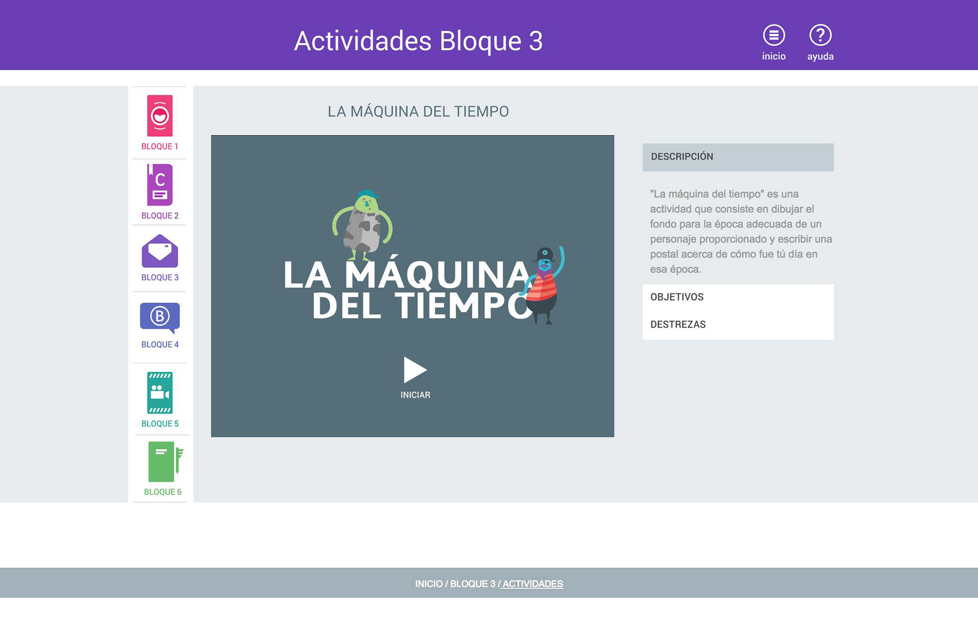
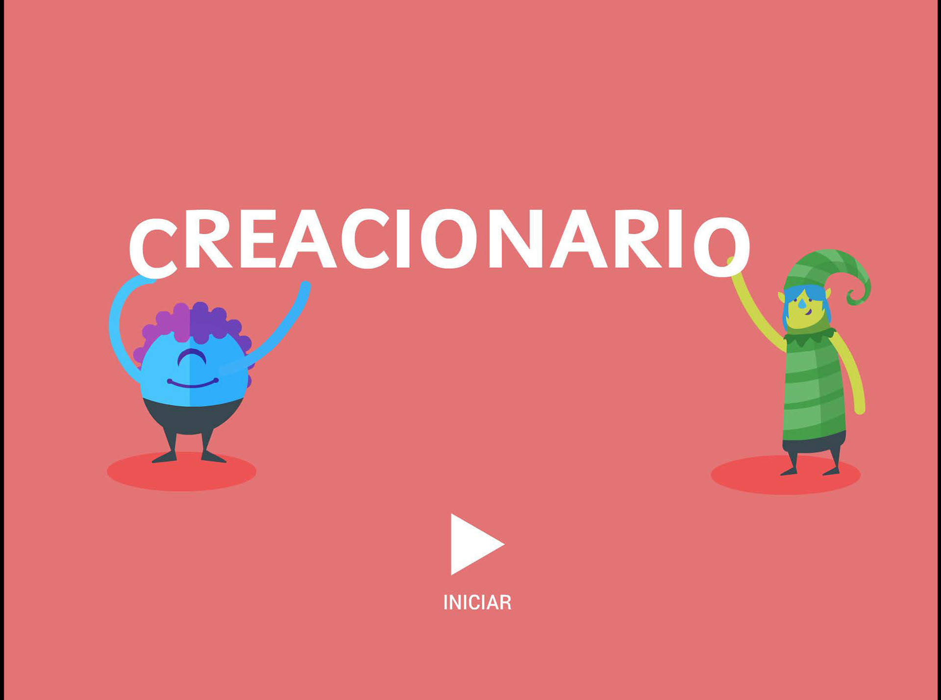
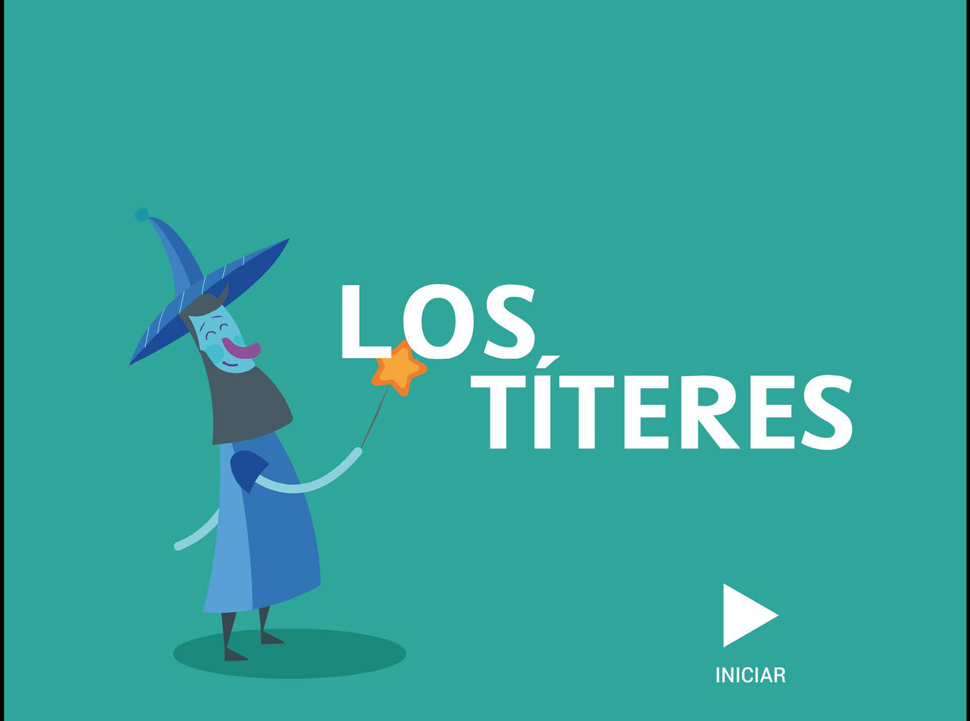
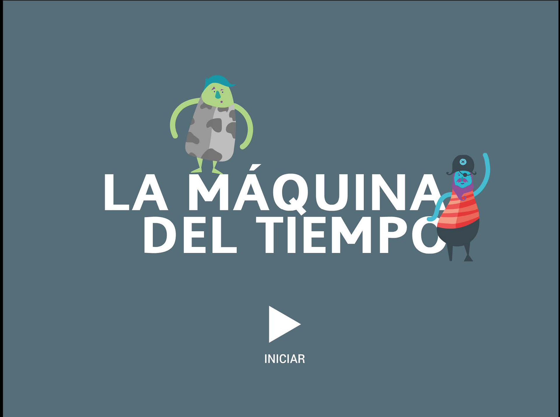
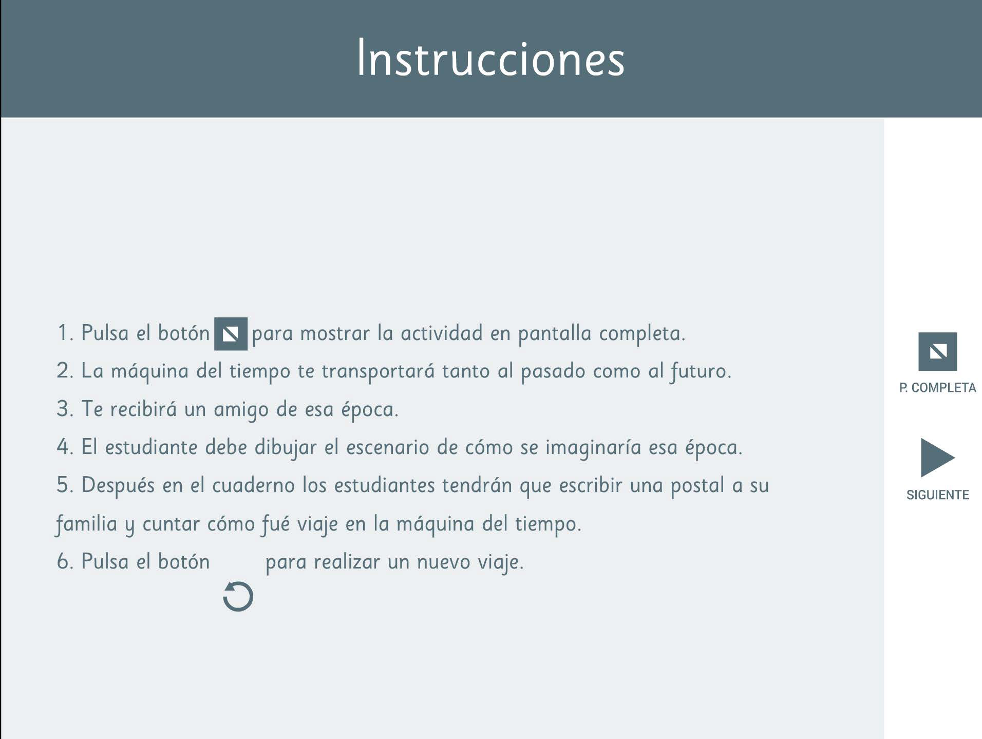
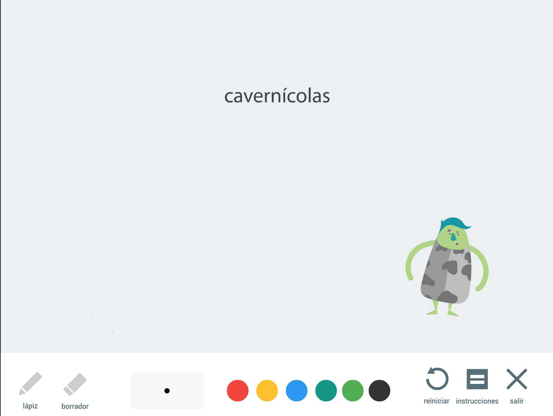
When you access the activity, you'll find that it's divided into three beautifully designed screens.
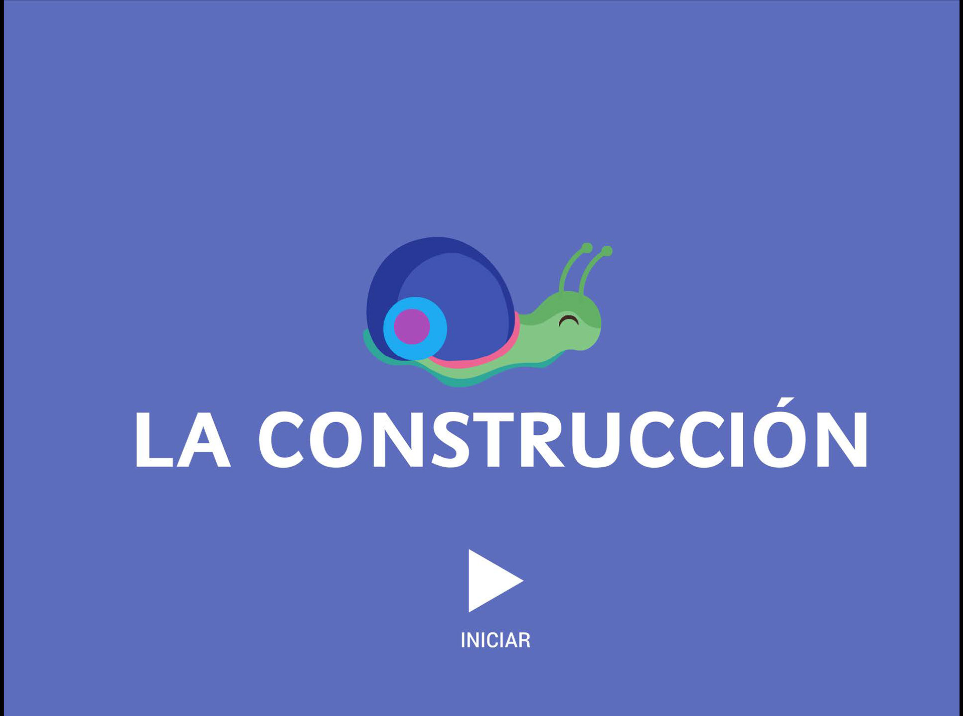
First, there's a welcome screen, which sets the tone for a fantastic experience.
Next, you'll find the introductions screen, where you can get to know the purpose and expectations of the activity.
The third screen is where the fun really begins! This is where you'll find all the activities, ready and waiting for you to dive into.
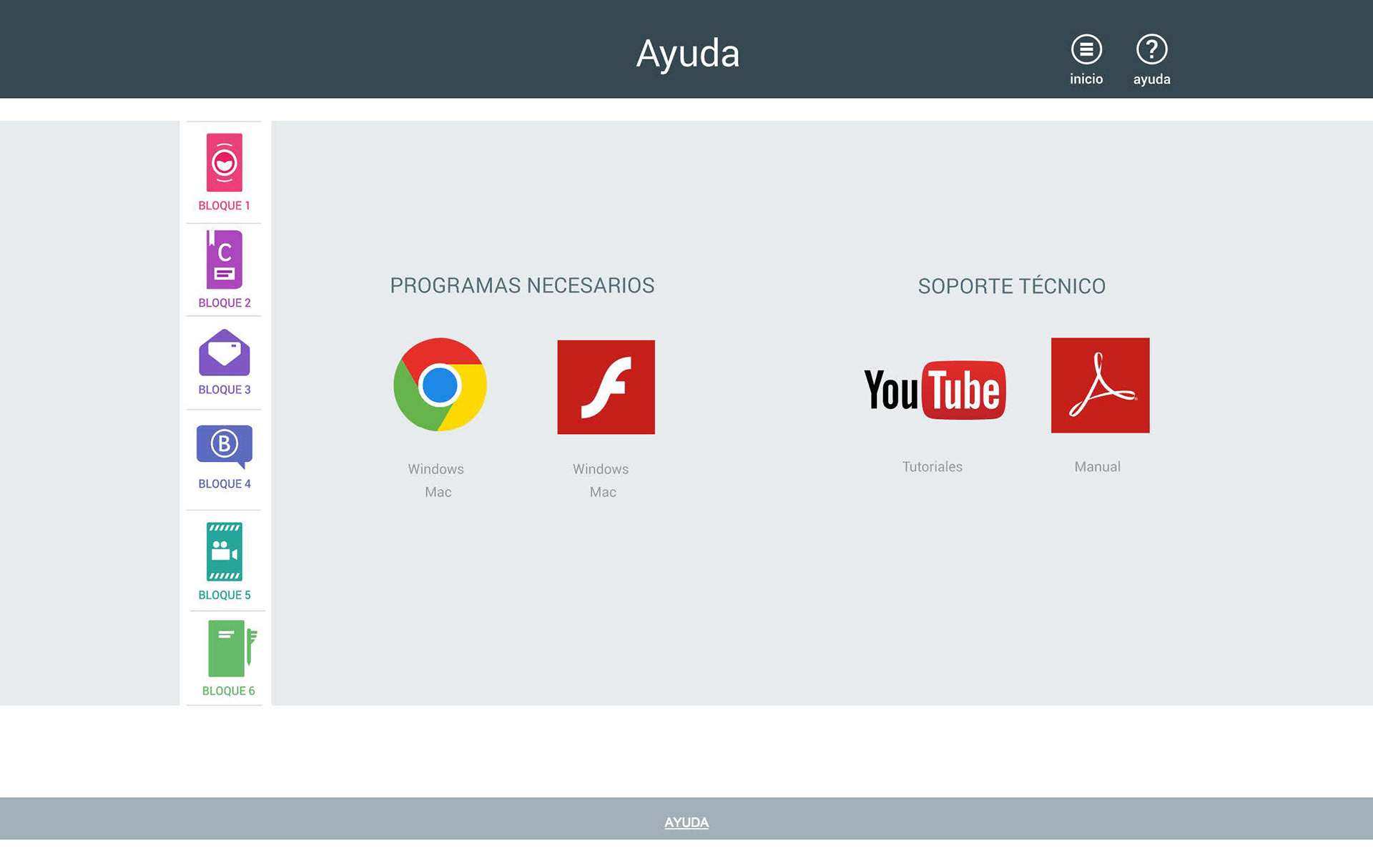
Finally, the Help screen is packed with resources, including links to software installers, a manual, and tutorials to ensure you can get the most out of the application with ease.
User Testing
I created a functional prototype that was tested in various web browsers to gain insights into user behavior. Over a period of two weeks, I conducted six usability tests, one in each block at different schools, with both students and teachers.
During these tests, I observed the students navigating the blocks and utilizing the app's various activities, collecting feedback at the end. Users' responses were both positive and surprising, while also highlighting areas for improvement, which I later implements into the final design. I enjoyed engaging with users, presenting innovative and interactive learning experiences, and gaining motivation to make user-focused design decisions.
During these tests, I observed the students navigating the blocks and utilizing the app's various activities, collecting feedback at the end. Users' responses were both positive and surprising, while also highlighting areas for improvement, which I later implements into the final design. I enjoyed engaging with users, presenting innovative and interactive learning experiences, and gaining motivation to make user-focused design decisions.
Conclusion
This project was an exciting journey! I found out from user testing that the application effectively promotes creativity and imagination in children while also helping them develop skills like drawing, speaking, and writing. It's great that even children without tech experience can use it with ease, and it can be applied across different subjects for a more interactive learning experience. I also saw that incorporating technology in the classroom can keep students interested in learning.
I was thrilled to see that one school actually implemented the app into their curriculum for six months. However, to further refine the design solutions, I'll need to conduct additional prototype testing and more extensive research. Thanks for taking the time to read through this case study!