The goal of this project is to redesign the workflow of Posgrados UDA website to become easier to navigate, show the most important information at the beginning and create an accessible website where all the stakeholders (students, professors and administrative personal) can have an access and show relevant information for each.
Project Info
Duration: 1 month
Skills: Web Design — UI Design — UX Design — User Research
Category: Education
Skills: Web Design — UI Design — UX Design — User Research
Category: Education
The Problem
The posgrados website (2019) was jam-packed with information and features, but unfortunately, was lacking organization and that special something that makes it truly user-friendly. Without that intuitive touch and attention to detail, the site can be a bit daunting and overwhelming for newcomers, like trying to navigate a labyrinth without a map. Plus, with its outdated design, it can feel like you're stuck in a time warp. Let's bring this website back to the present and make it a seamless, user-friendly experience for all!
Based on several interviews with daily users, I try to identify several pain points that occur during the experience.
Pain Points
Students can't find information about their study program: This can be frustrating and time-consuming, especially if they need to find specific details about courses, schedules, or requirements. The information is buried in a confusing navigation and not labeled appropriately.
Professors can't have access to contacts of other departments: Professors often need to collaborate with other departments or staff members to coordinate events, discuss projects, or share resources. The website doesn't provide a clear and accessible directory of departmental contacts making it hard to find the right person to reach out to. This can lead to miscommunications or missed opportunities for collaboration.
Administrative personnel finds confusing the access to the study platform: Administrative personnel, such as admissions staff, use the website to manage student records and access reports. The website is poorly organized and it's difficult for them to find the right platform to perform these tasks. This can result in wasted time and frustration.
Research
I conducted interviews with a diverse group of 20 participants, including prospects, students, professors, and administrative personnel. Through these conversations, I sought to gain a deeper understanding of their website usage patterns, pain points, and aspirations for improving their experience. Based on these insights, I was able to confirm the initial assumptions and identify four distinct user personas with unique needs and goals depending on their tasks on the website.
Persona
The Prospect Student
This persona represents individuals who primarily are interested in understanding the admission requirements and deadlines, comparing different degree options, and getting a sense of the student experience at the institution.
The Current Student
This persona represents individuals who primarily use the website to access course materials, check grades, and communicate with instructors. They are typically tech-savvy and time-constrained, seeking a user experience that is fast, easy-to-use, and customizable. They often prefer a mobile-first approach and require intuitive navigation to find the information they need quickly.
The Professor
This persona represents individuals who primarily use the website to manage course content, grade assignments, and communicate with students. They are typically busy and require an interface that is straightforward and easy-to-use, allowing them to complete their tasks with minimal effort. They may also require specialized features such as gradebooks and analytics to help them manage their workload.
The Administrative Personnel
This persona represents individuals who primarily use the website to manage administrative tasks, such as scheduling and resource allocation. They require an interface that is efficient and capable of handling large volumes of data, with the ability to export and manipulate data for further analysis. They may also require specialized access levels and reporting capabilities to perform their duties effectively
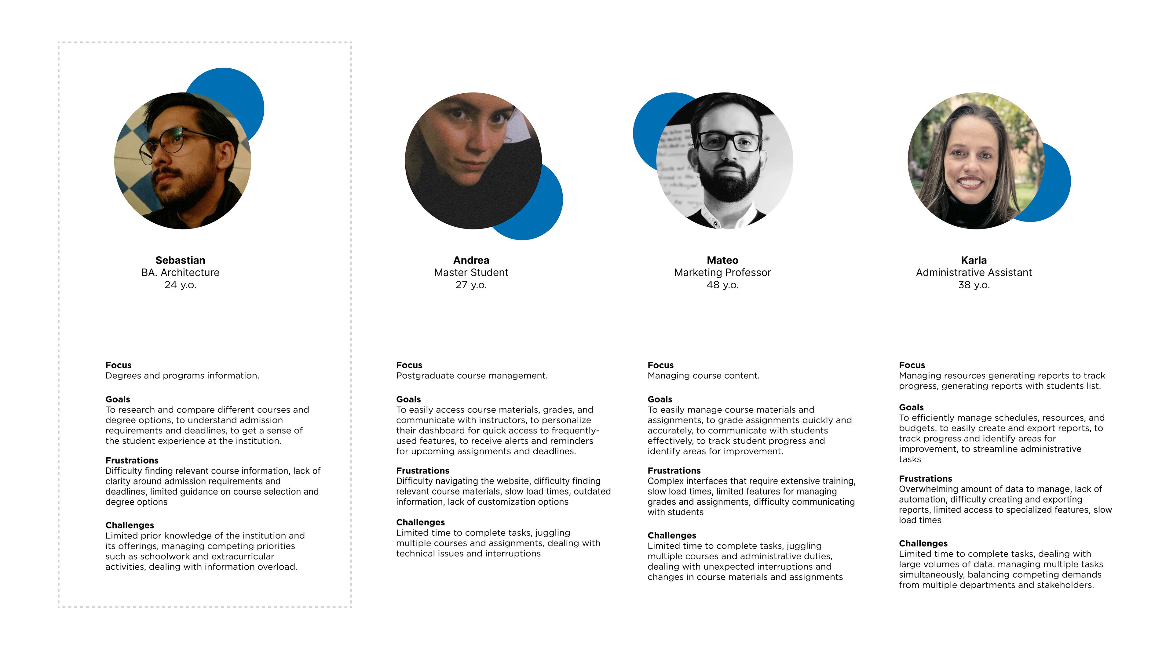
The focus of this case study will be on the Prospective Student Persona. While other user personas use the main website to access the CMS platform Moodle, this research will focus solely on the main website.
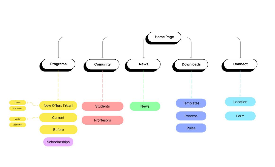
Information architecture
To understand more about the website structure, I created a rough rendition of the Posgrados information architecture.
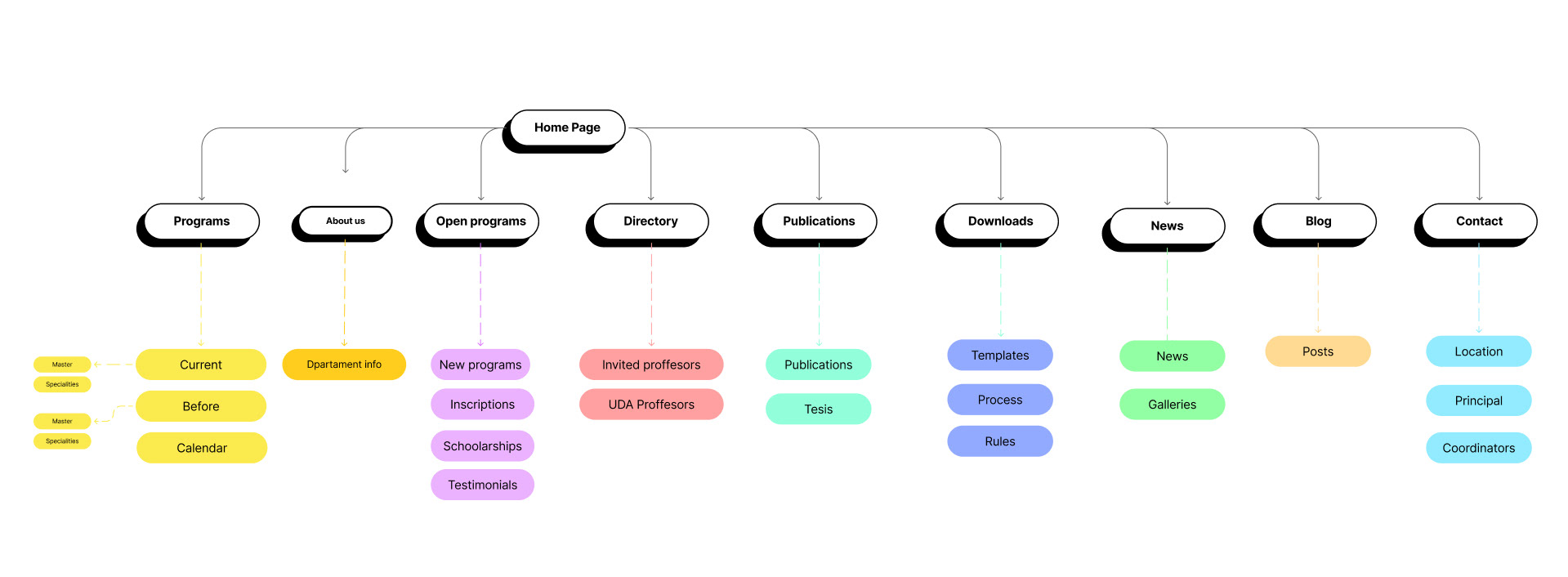
With the card sorting method, I identified another information architecture considering users experience with the website and completed the research. Thus I proposed a new information architecture design for the website, with a simpler and more intuitive arrangement of the functions.
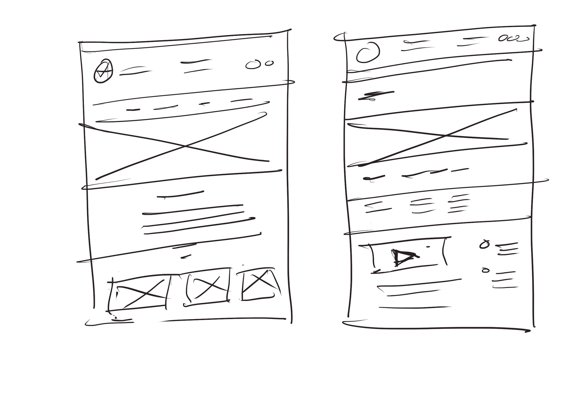
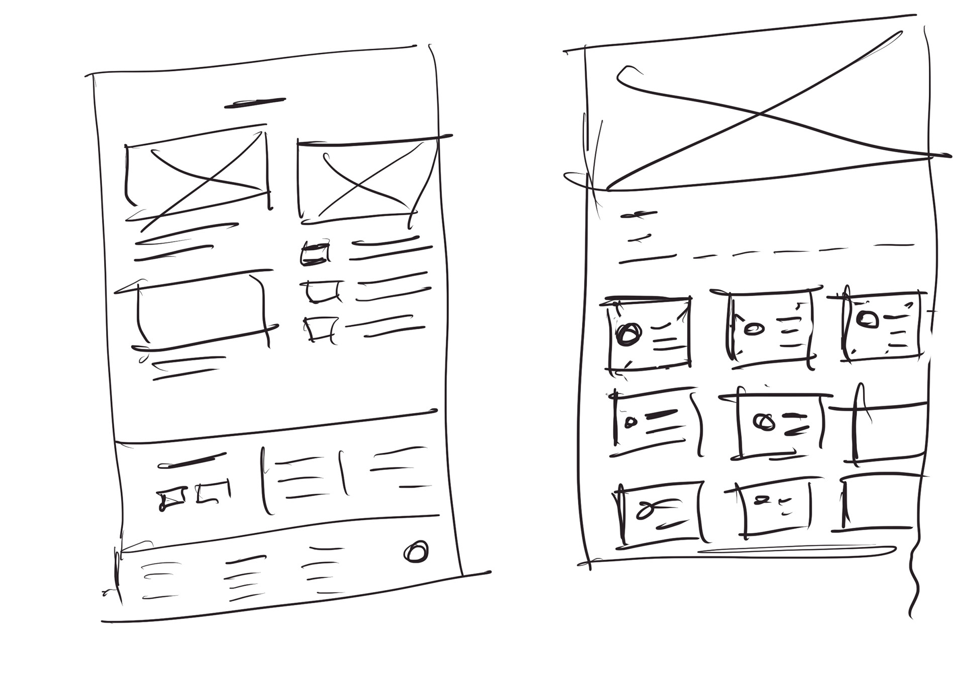
The next step is to redesign the interface. I started with pencil & paper, develop several paper prototypes before moving on to high fidelity wireframe
Solutions
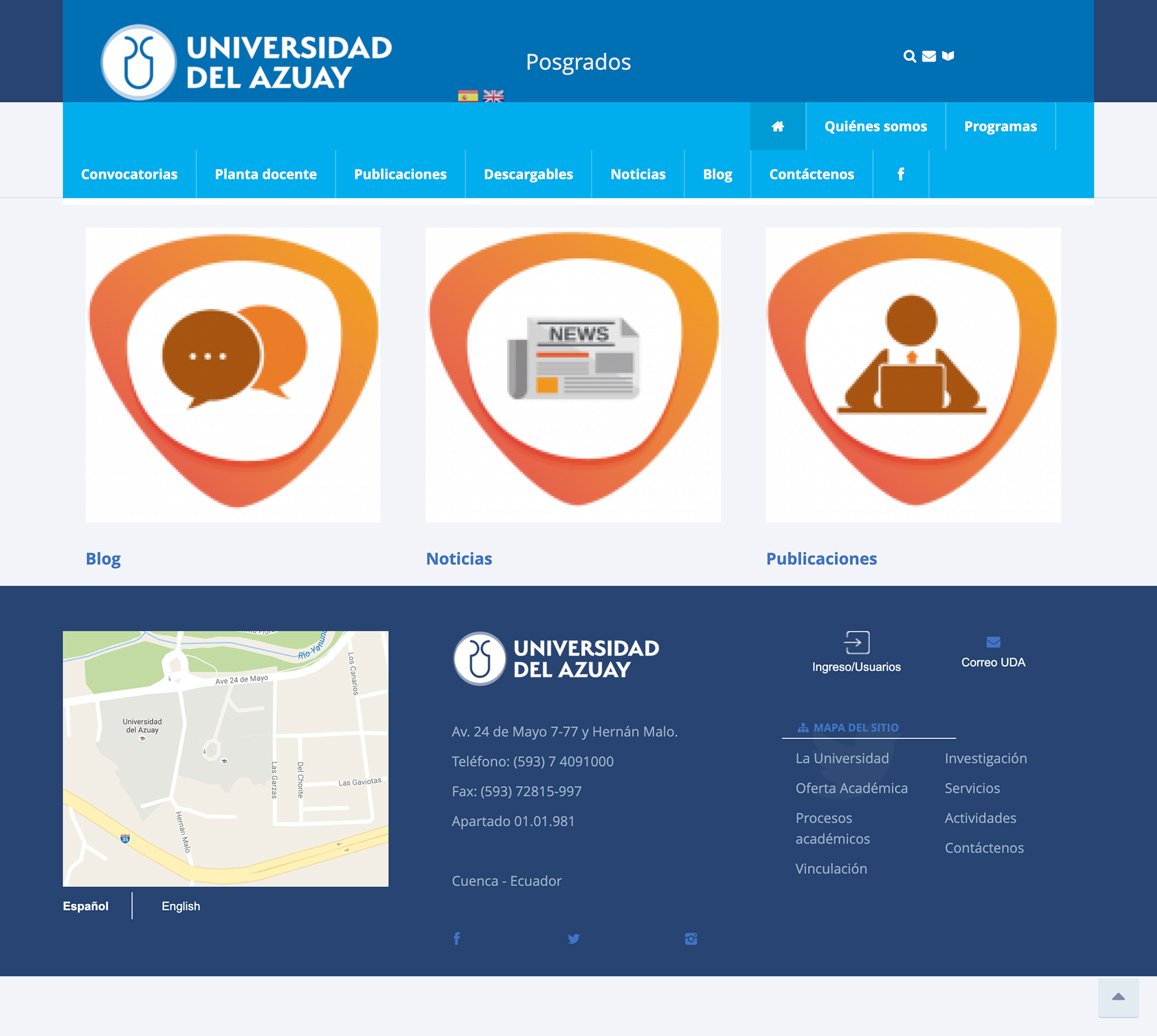
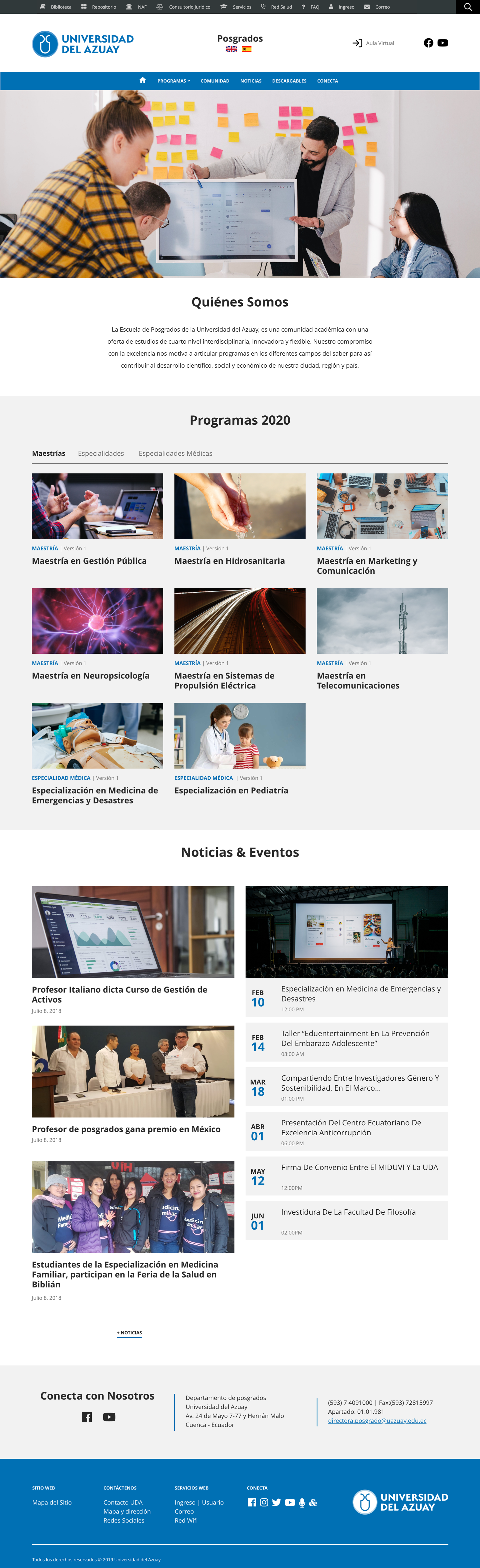
Home — Before

Home — After
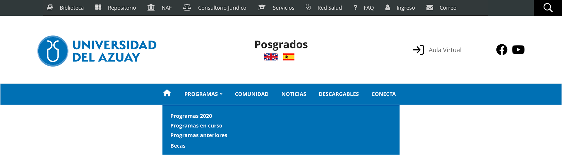
Simple menu options
A black menu was added to the site to ensure consistent navigation with the main website of the university, and the correct blue color from the branding was added. The main menu was also streamlined to include only essential elements, while other elements were redistributed into other sections.
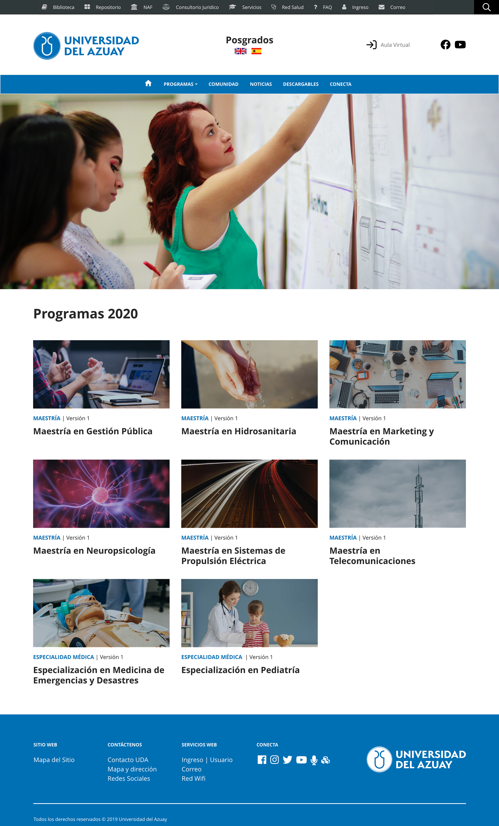
Smarter categories
On the main home page, a department presentation was added, along with a clear and organized presentation of new degree offerings. These degrees were separated into categories such as Masters, Specialities, and Medical Specialities. To provide a better user experience, a big image related to each degree was added for visual interest.
More information... less clicks
To keep users informed and engaged, a news and events section was also added to the main home page. This allows new users to get all the relevant information they need in a single, easy-to-scroll view. Overall, these changes were designed to enhance the user experience and provide a more intuitive and engaging website for prospective students.
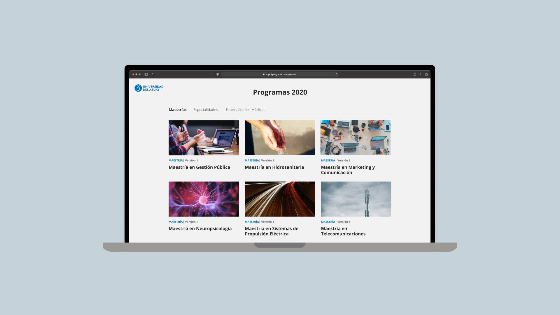
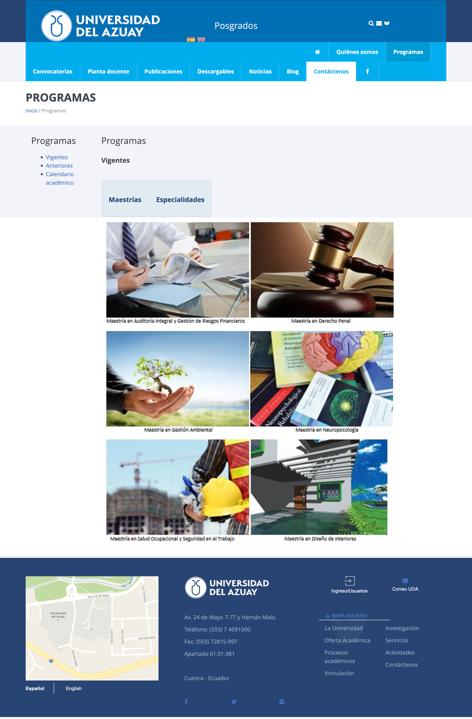
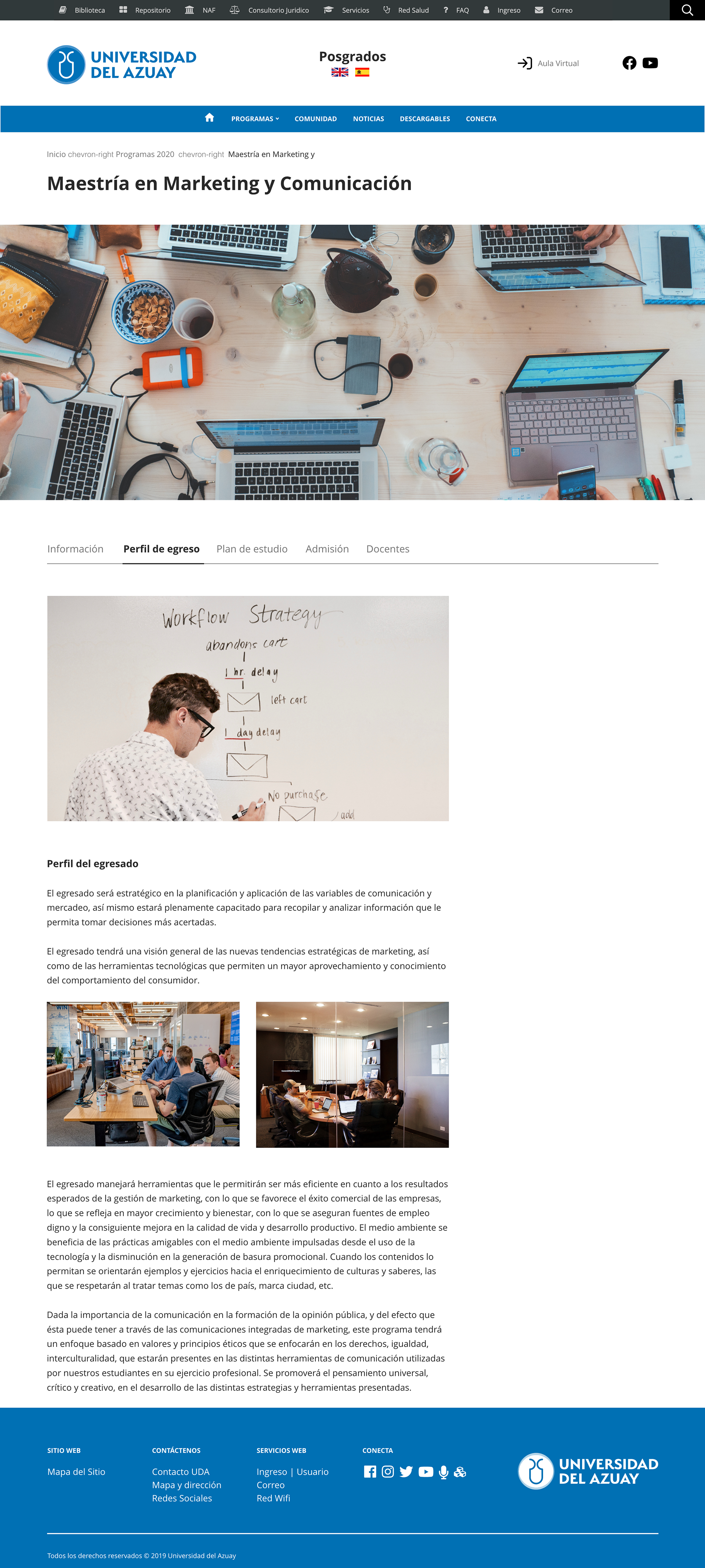
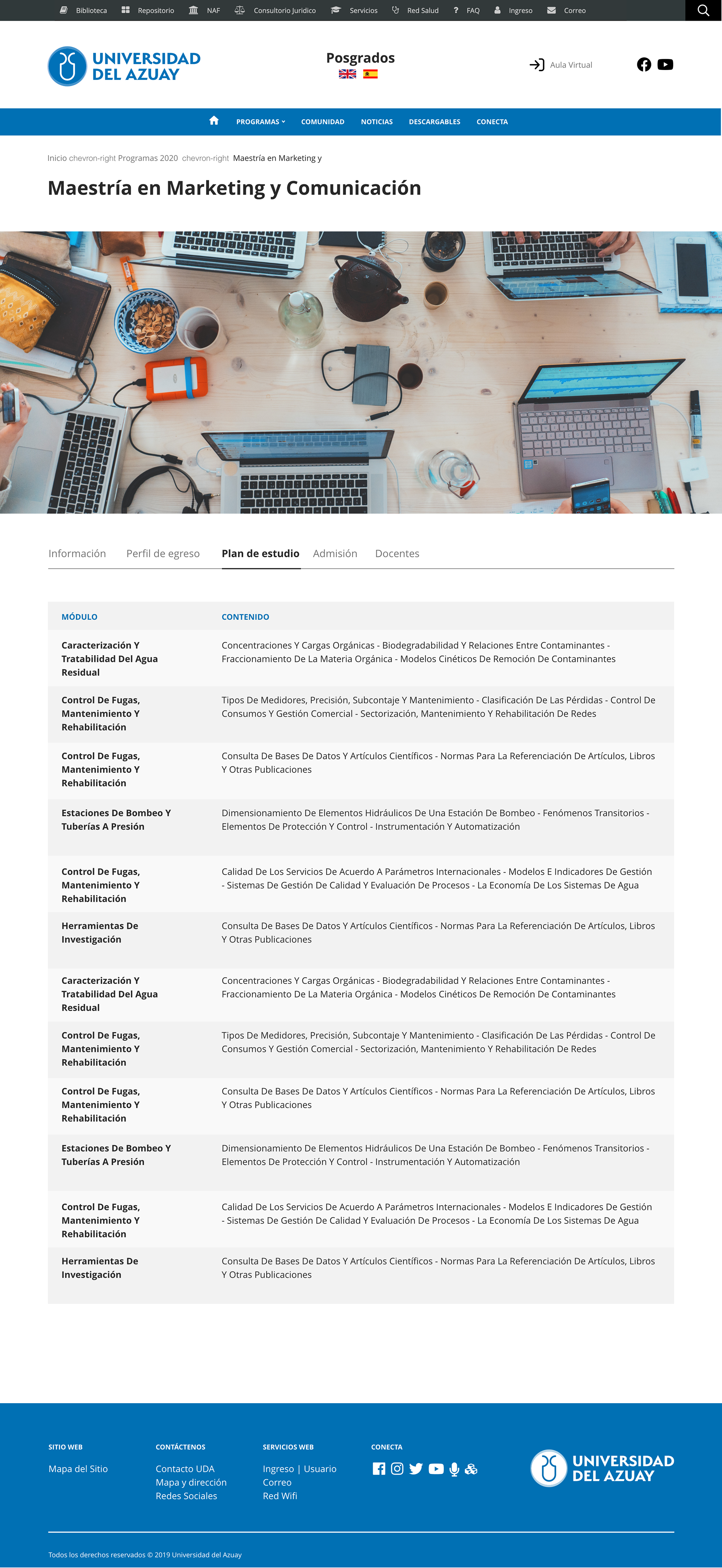
Programs — Before
Programs — After
I made several changes to improve the user experience for users seeking information about programs. The first step was to add Current Programs, New Programs, and Past Programs to the main menu, so users can find the information they need more quickly and with fewer clicks.
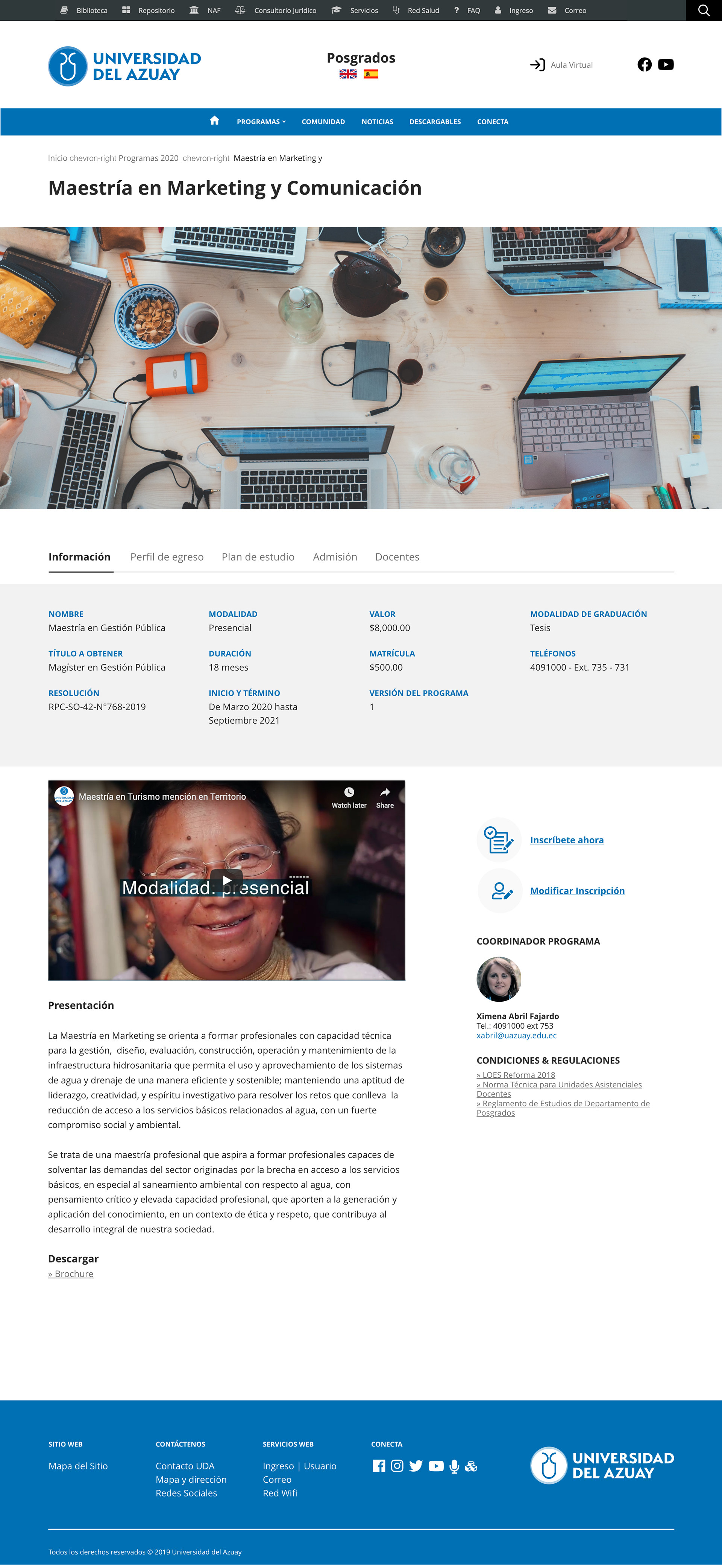
Better program information
To improve the presentation of program information, I created a new system that uses tabs to show all relevant information at once. This new system also includes a new layout that features more multimedia content and relevant sections for required documents, application systems, and other relevant information for each program. By consolidating this information in one place, users can find all the relevant information they need for a specific program without having to search all over the website.
Conclusion
Due to time constraints, the research is limited to a smaller user audience and a small amount of data. More extensive research and additional prototype testing need to be conducted in order to refine the design solutions. Thank you for reading through this case study. If you have any feedback, I’d like to hear from you.